HR · B2B · Form Design
Add Employee Form Redesign
Redesigned the employee onboarding form to streamline data entry, integrate payroll enrolment, and resolve long-standing usability issues.
Overview
The add employee form is the first touchpoint of onboarding — where admins populate employee details into the system and send out invitations. It's a high-frequency workflow for HR managers, and it had accumulated usability debt over time.
I led the redesign to streamline the flow, integrate a new payroll enrolment step, and fix friction points that had been eroding the experience.
Business Objectives
- Reduce completion time: A faster, less error-prone form directly improves customer satisfaction and drives word-of-mouth referrals.
- Resolve usability debt: Address long-standing UX issues that had been flagged through customer feedback and my own audit of the existing flow.
Process
- Gathered customer feedback from the co-founder and customer success team, then audited the existing flow myself to uncover additional issues beyond what was reported.
- Mapped the user journey end-to-end to identify where the new payroll enrolment step fits naturally.
- Explored different layouts and interaction patterns for each step, testing which combinations reduced cognitive load.
Key Design Decisions
1. Surfacing the affordance of task templates
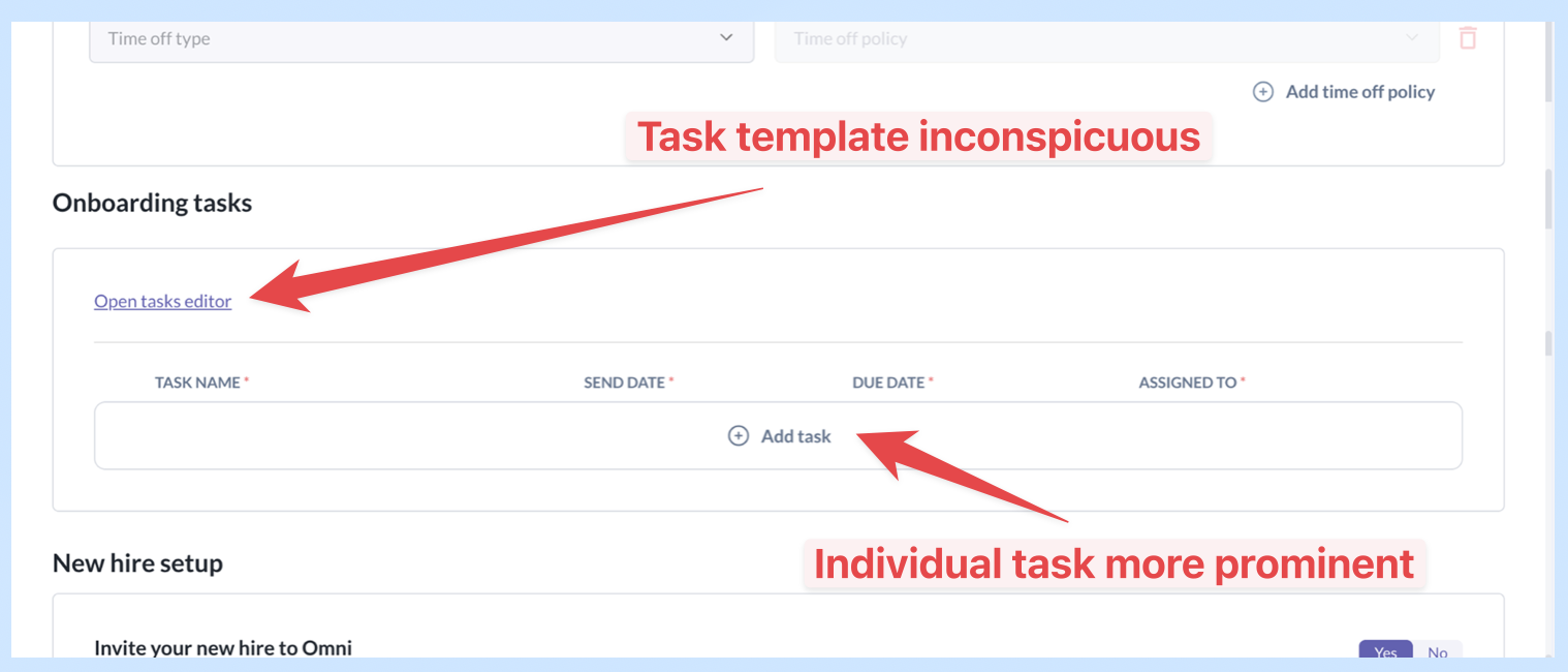
Situation: Task templates were hidden in the task editor, and the link itself was inconspicuously placed on the top-left corner.
The “Add task” was more prominent in the main screen, so users naturally added tasks instead of leveraging task templates.
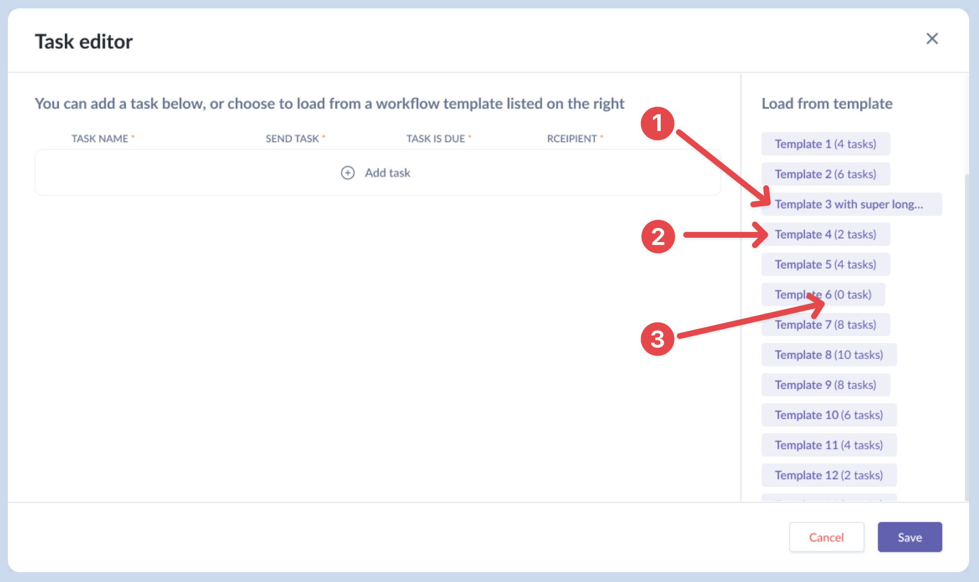
There were other UX issues with the task editor.
- Users couldn't tell how many tasks there were for templates with very long names.
- Users couldn't tell what the tasks in each template were unless they loaded it into the editor.
- Empty templates (zero tasks) are also listed, taking up space.
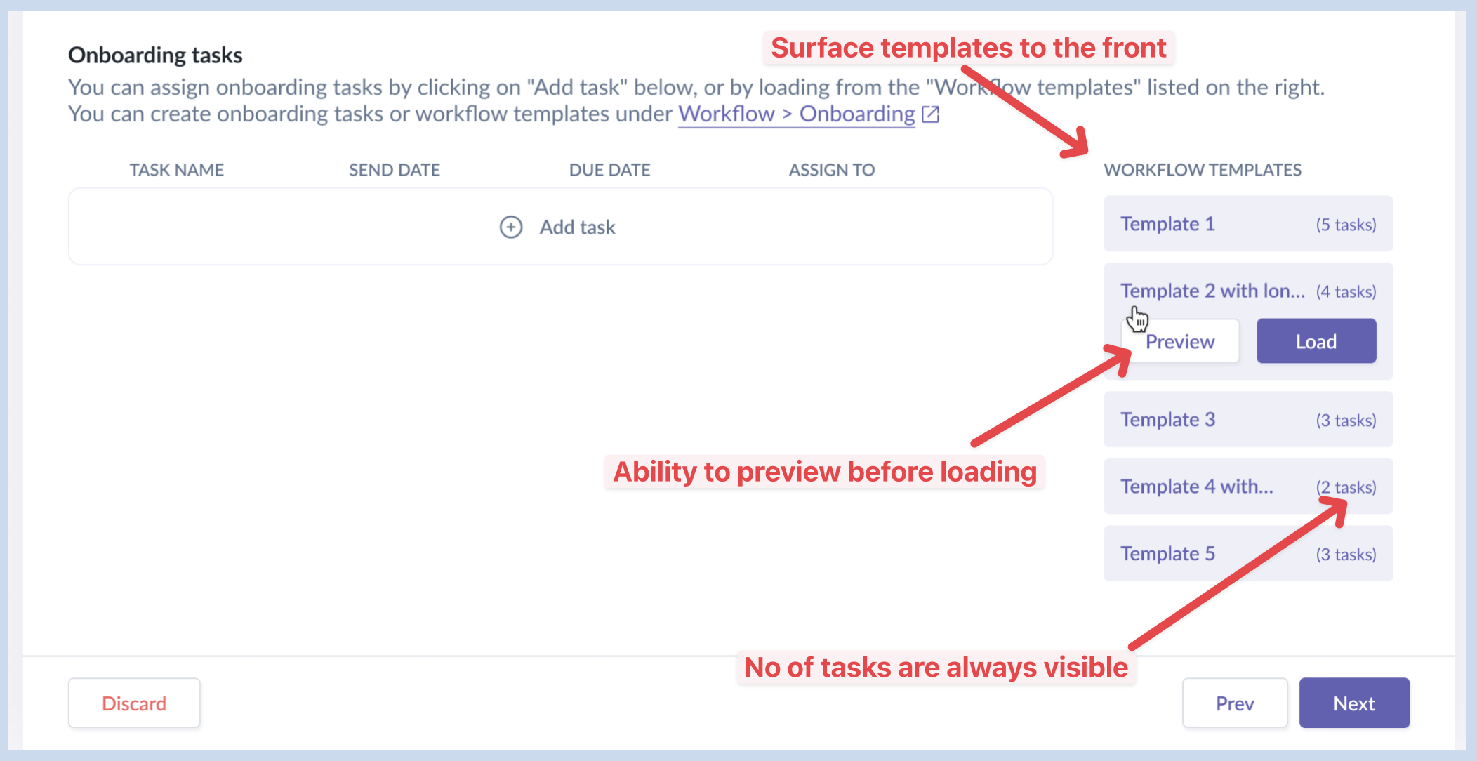
Decision: Surface the task templates to the front with slight background accent to get more attention than “Add task” outlined button.
Other changes:
- Hide all empty templates.
- Truncate long template names so number of tasks are always visible.
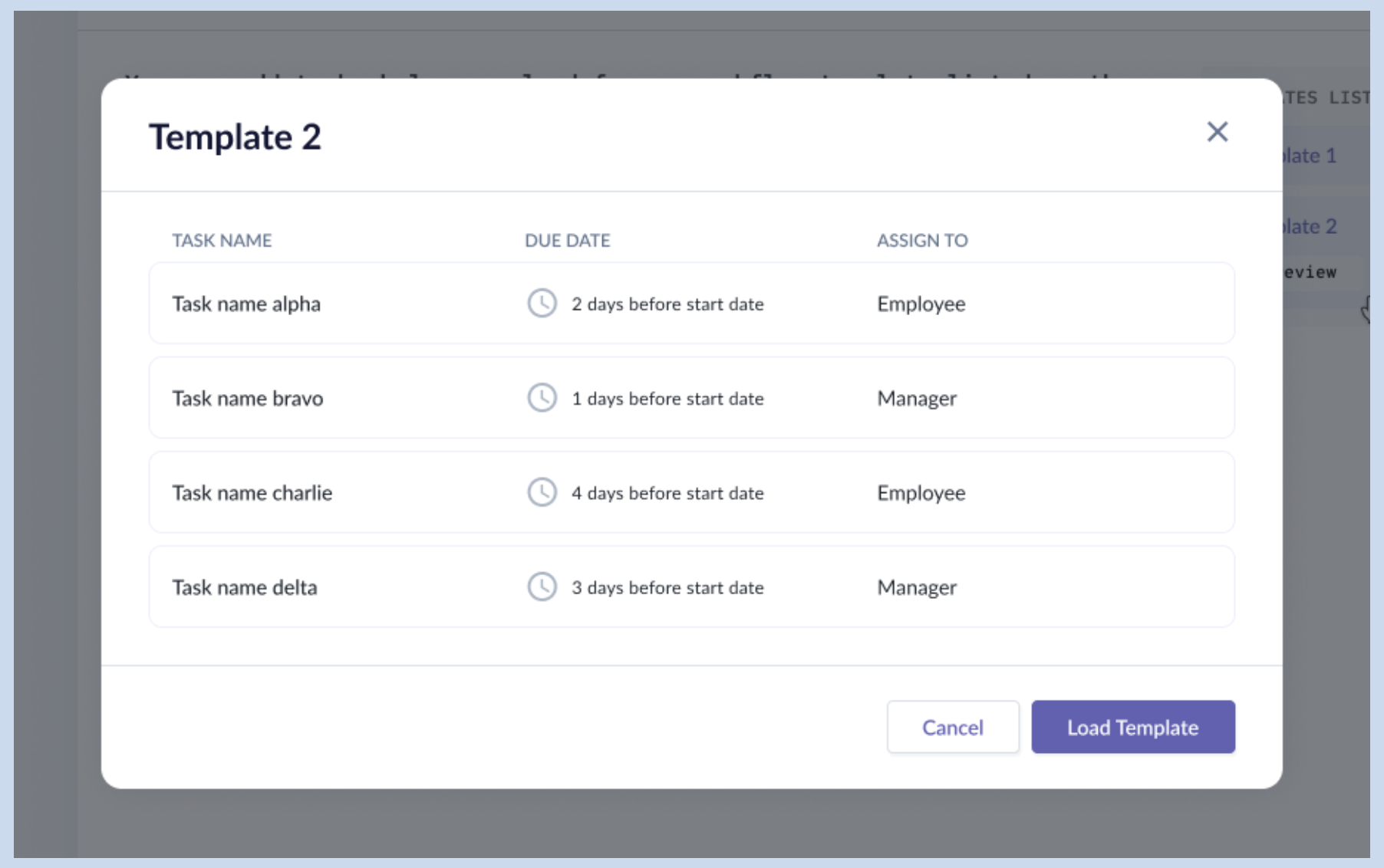
- Introduced a Preview button, allowing the admin to preview the tasks in a modal before deciding to load them. Took reference from Miro’s templates library that has a similar function.
Rationale:
- Using contrast in background to bring users' attention to the task template section.
- Allowing users to preview a template's tasks before committing gives them a sense of control.
2. Integrating with the new Payroll Module
Situation: Ever since the new Payroll module was released, the users have been requesting for the ability to enrol the new hire directly into payroll while adding them into the org via the add employee form.
They found the flow incomplete, and friction existed as they still needed to go to the Payroll module to do manual enrolment for the same new hire.
Compensation was part of the previous core section, and Payroll is a completely new module that had more sections than the 3 compensation fields. I had to factor in clients who haven’t bought the Payroll module to continue using Compensation.
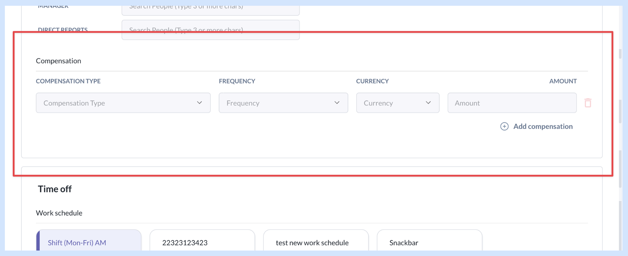
Decision: Display the relevant sections and fields through progressive disclosure. System would check the modules purchased by the clients.
- Those without the Payroll module would continue using the Compensation section;
- Those who had it could choose to enroll the new hire or not;
- If they chose to enroll, the admin needs to provide the payroll details; or else, they would just provide the compensation details, as before.
How we got there: Mapped the new add employee form journey with the new step of enrolling the employee into a payroll org, taking note of the various paths that the admin could take and designed for them.
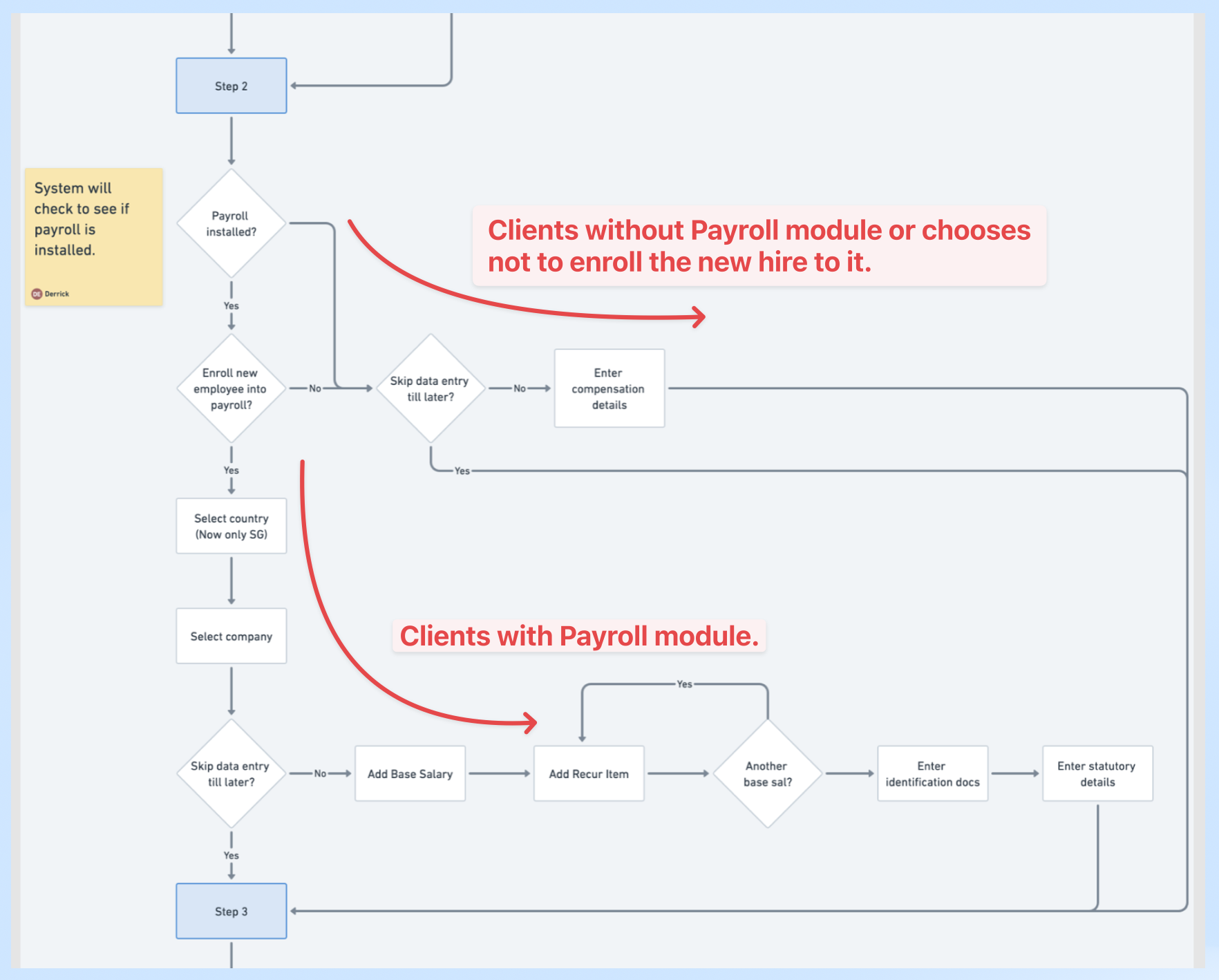
Rationale: Providing for all user journeys gave the admin full control over the whole process.
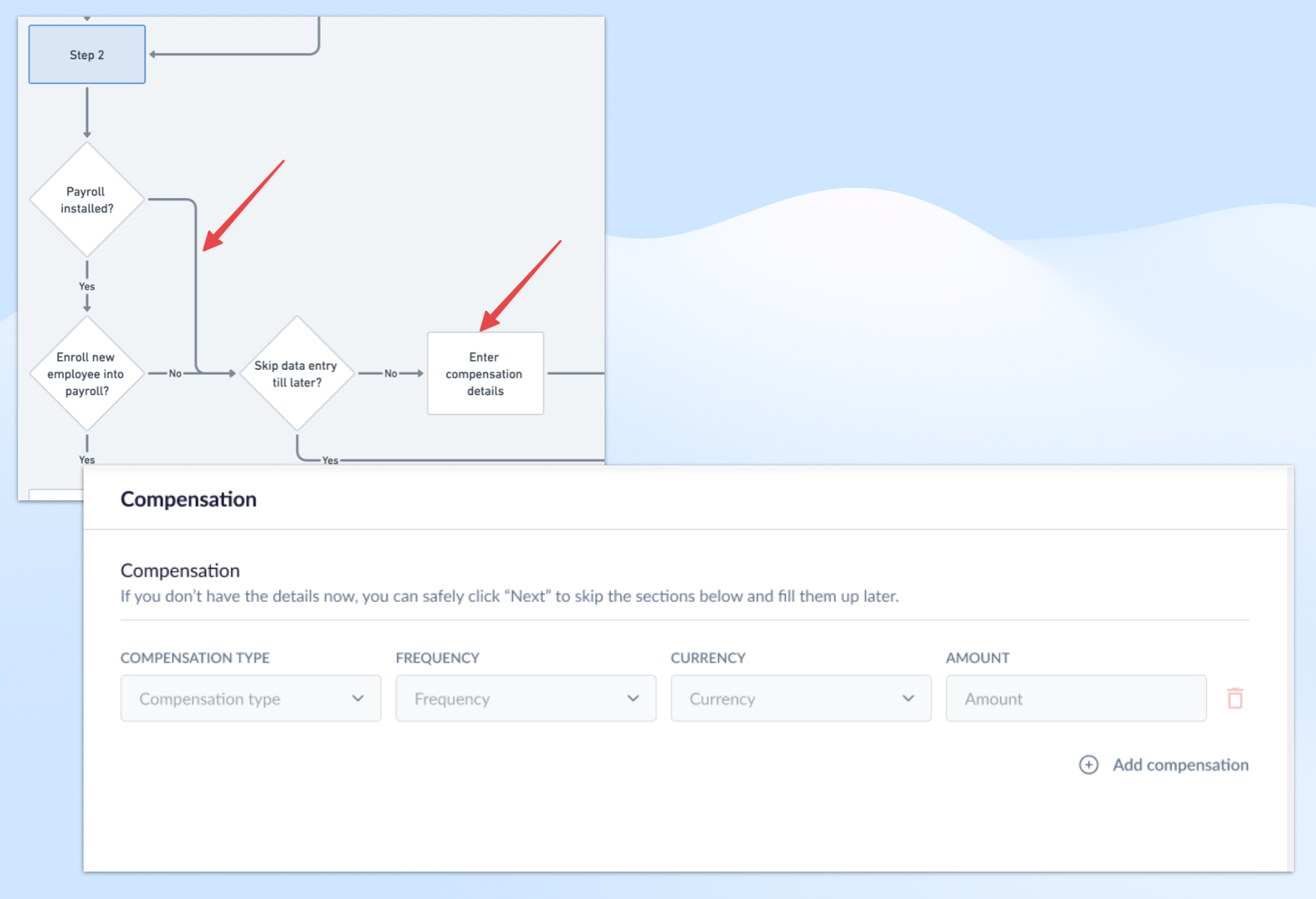
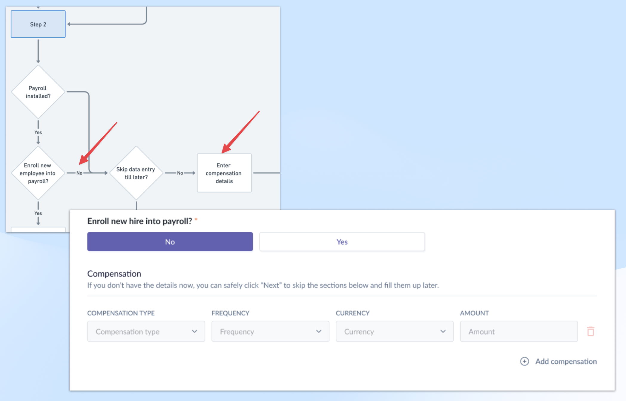
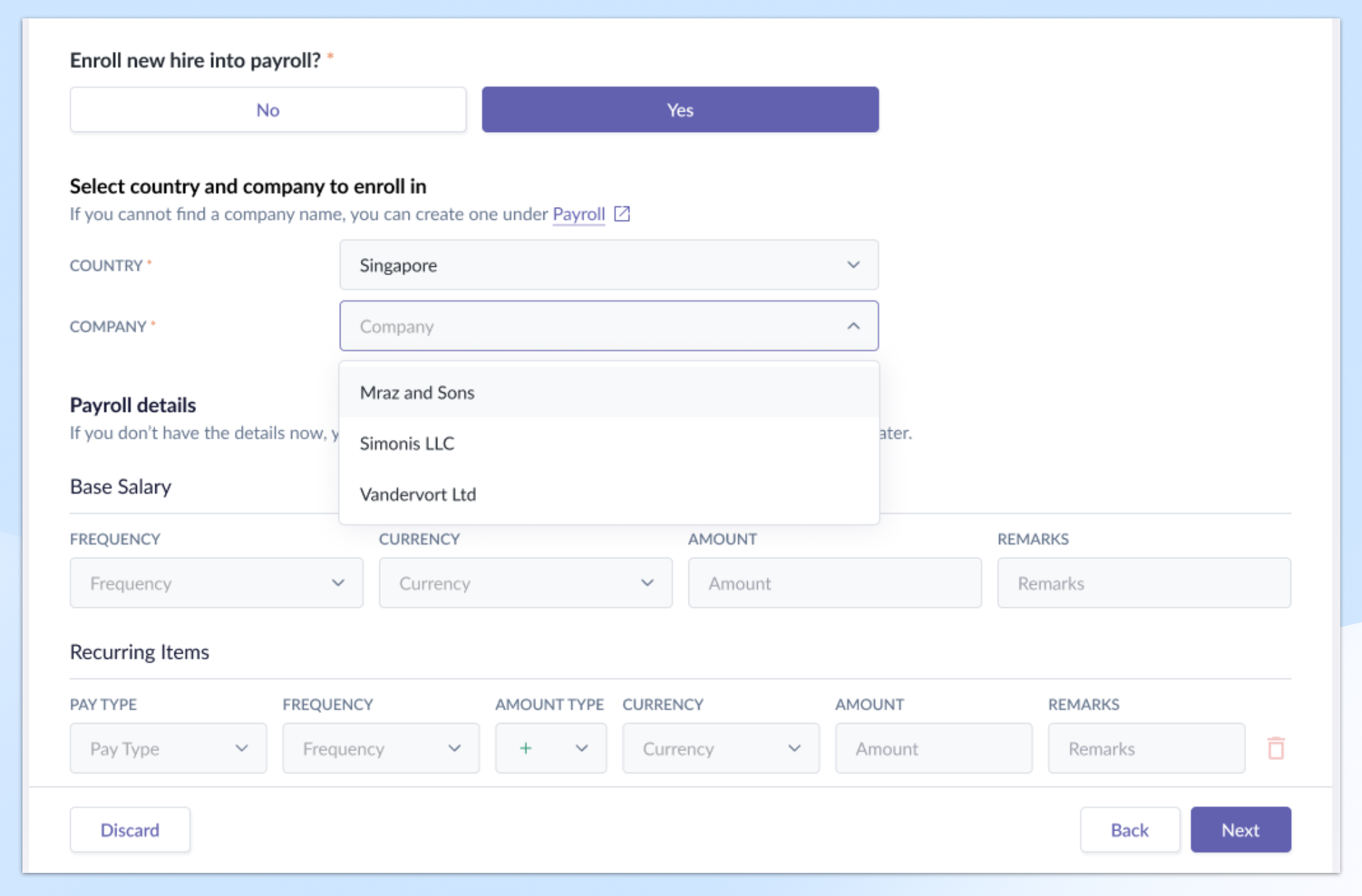
Other changes: For the Base Salary and Recurring Item details, I used hidden logic to imply the values for Effective Date and Event. Typically, these fields are manually entered in the Payroll module.
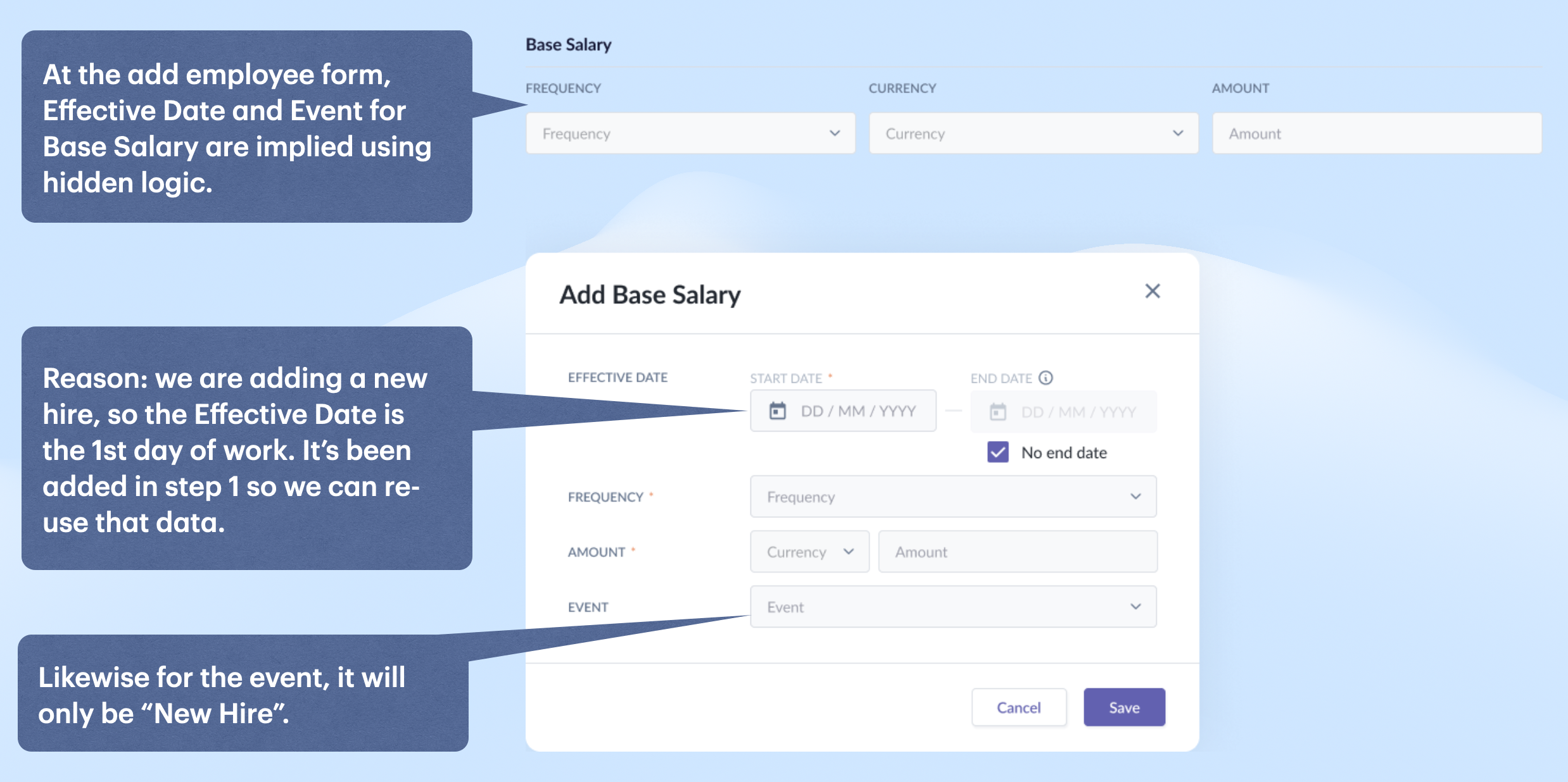
Reason: Since we are adding a new hire, the Effective Date can only be the 1st day of work. It was added in step 1 so we could re-use that value. Likewise for Event, the value can only be “New Hire”.
By doing so, we reduced the fields the admin needed to populate, thus speeding up the process.
3. Revising work schedule step
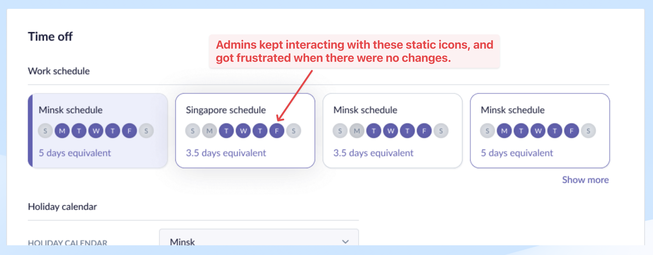
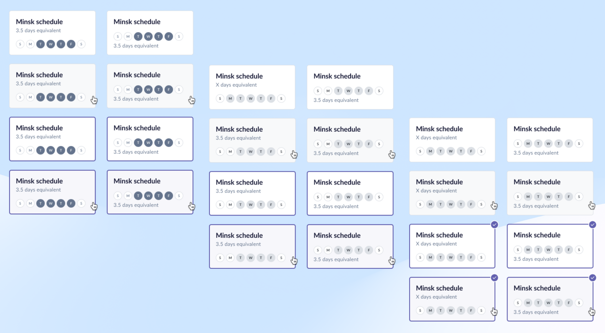
Situation: Users kept clicking on those round static icons, thinking that they are interactive. They thought the system had become inactive when no changes were made.
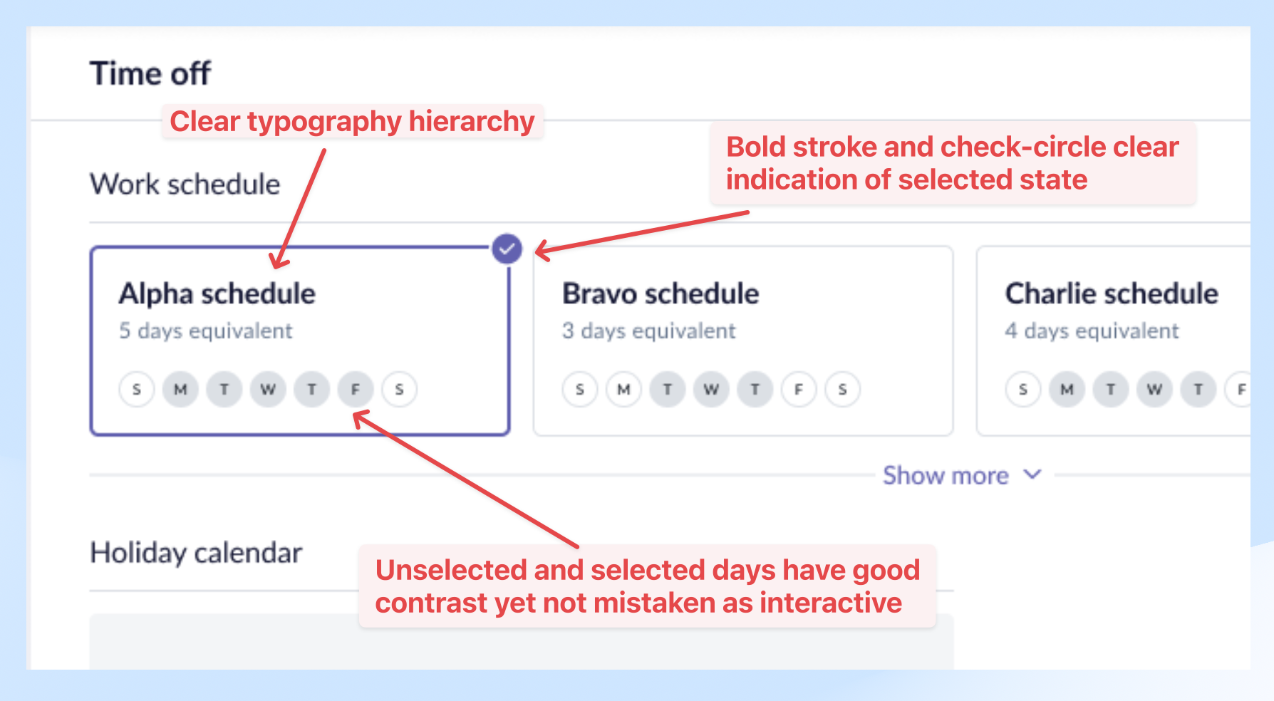
Final design:
- Clear hierarchy of header and description text.
- Selected days have good contrast and won’t be confused as interactive buttons.
- Refreshed radio card with a check-circle icon; also has a clear indication of selected state.
4. Converting form to multi-step wizard
Situation: The form is very long and the admins found it overwhelming with so many sections and details on a page.
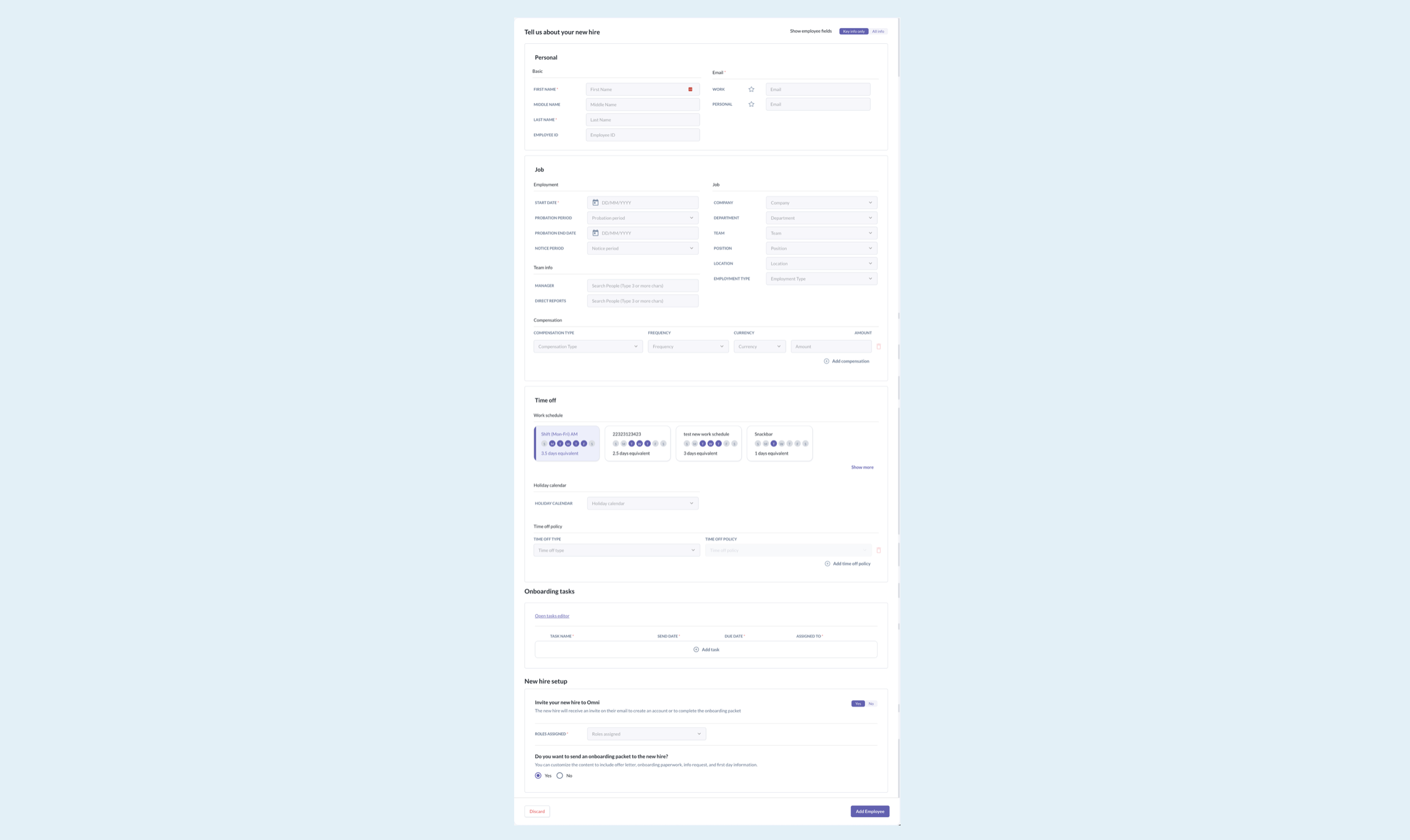
Various exploration versions were tried before we finalized the designs, after getting feedback from stakeholders.

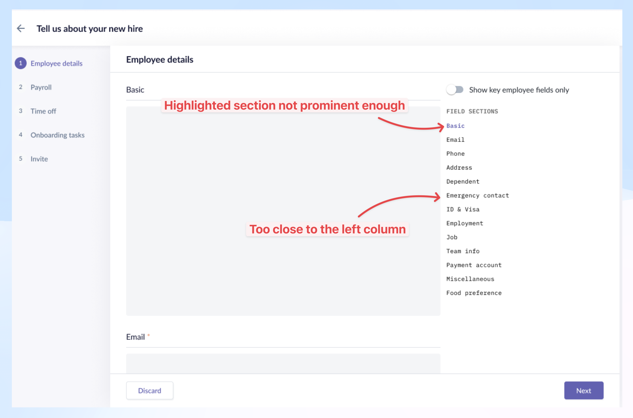
Final design:
- Broken down into 6 essential steps: employee details, compensation, time off, onboarding tasks, invite access, summary.
- Added toggle to show only key fields and quicklinks to each field section in step 1.
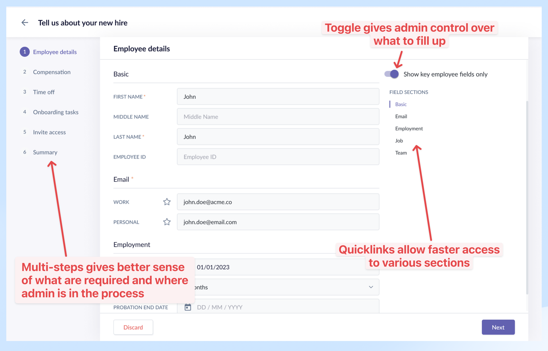
Reason: Each step maps to various key modules in the system, making it modular and easier to maintain. The toggle to show only key fields gives admins control over what to fill in when they have only limited info initially. Quicklinks allow admins to quickly jump between sections when the form is long.
5. ATS integration (scoped out)
I timeboxed an exploration of pulling employee data from an ATS app to pre-fill the form. The interaction and flow showed promise, but we couldn't converge on a final form within the timebox — and it was a deep rabbit hole. I recommended deferring it to a later iteration rather than shipping something half-baked.
Reflection
What I'd do differently
- Present all steps in a single view with detailed work handled in drawer modals — reducing the perceived complexity of the multi-step flow.
What the system still can't do cleanly
- Inline editing at the summary step and the ability to jump across completed steps — both worth tackling in a future iteration.