Cycling · E-commerce · Personal
Giant Adventure Tour Redesign
A self-initiated redesign of a Singapore cycling tour operator's website and booking experience.
Background
I came across this website when I joined my friends on a cycling trip in Taiwan a couple of years back.
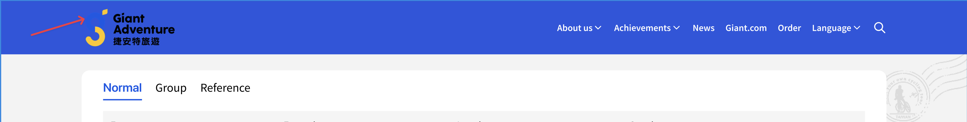
Giant Adventure is the tour arm of Giant Bicycles, organising cycling tours within and beyond Taiwan for tourists and cycling enthusiasts. Visitors can search for and book tours through their website.
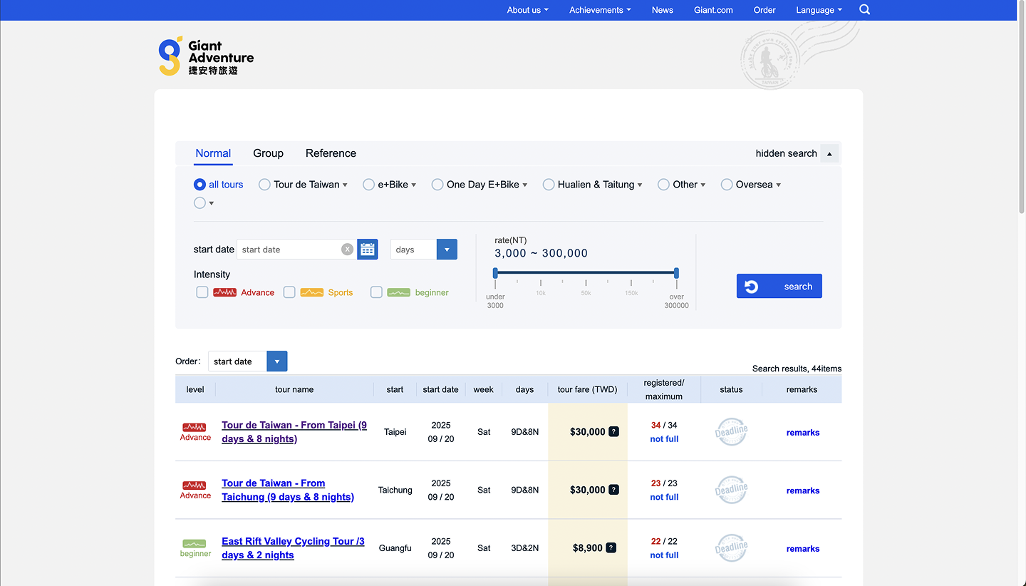
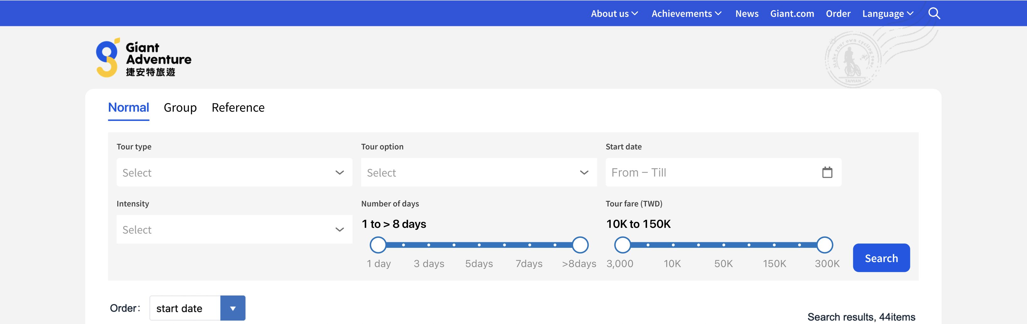
The site worked fine, but the search controls took up a big chunk of the screen real estate. I felt the whole experience of searching and filtering tours could be improved with some UX and visual tweaks.
Design goals
- Reduce filter complexity so visitors can find tours faster;
- Improve scalability so the UI holds up as more tour categories are added;
- Reclaim wasted screen space to give tour results more prominence.
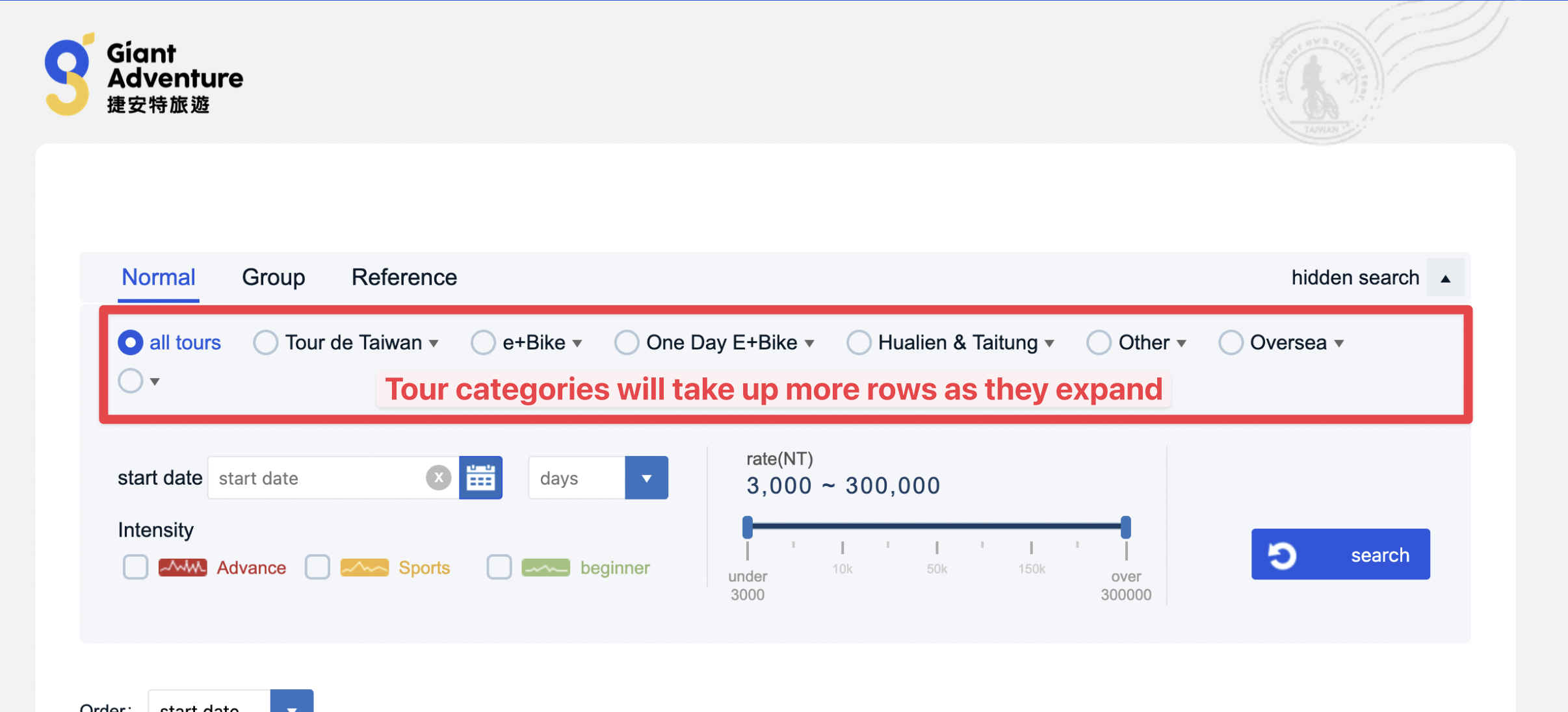
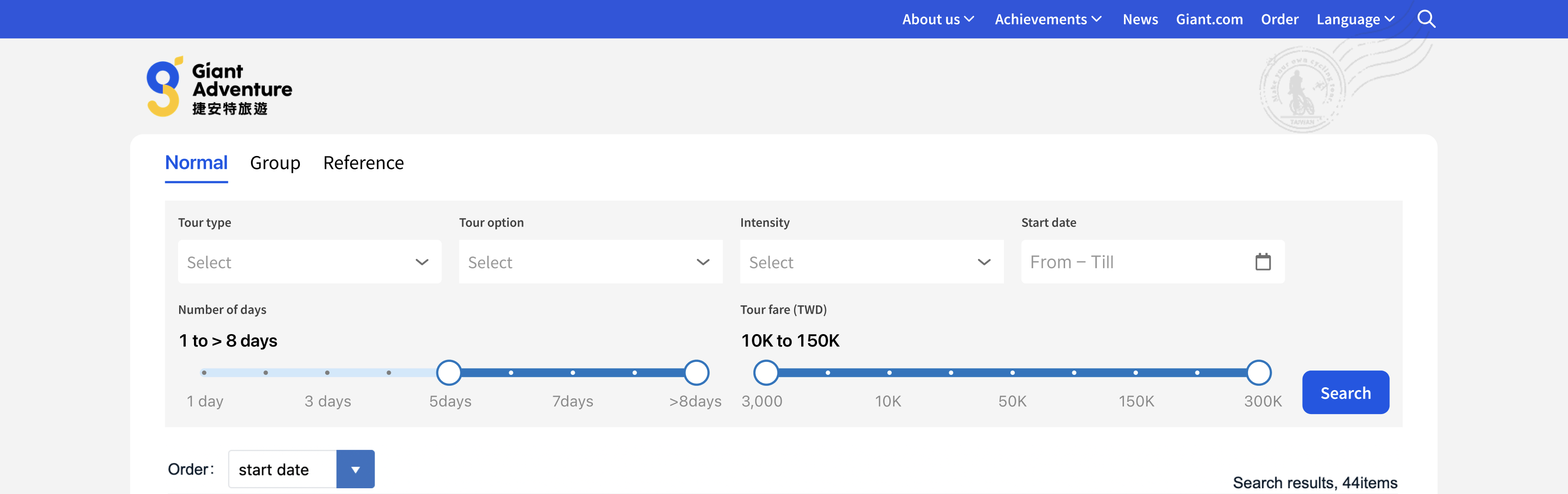
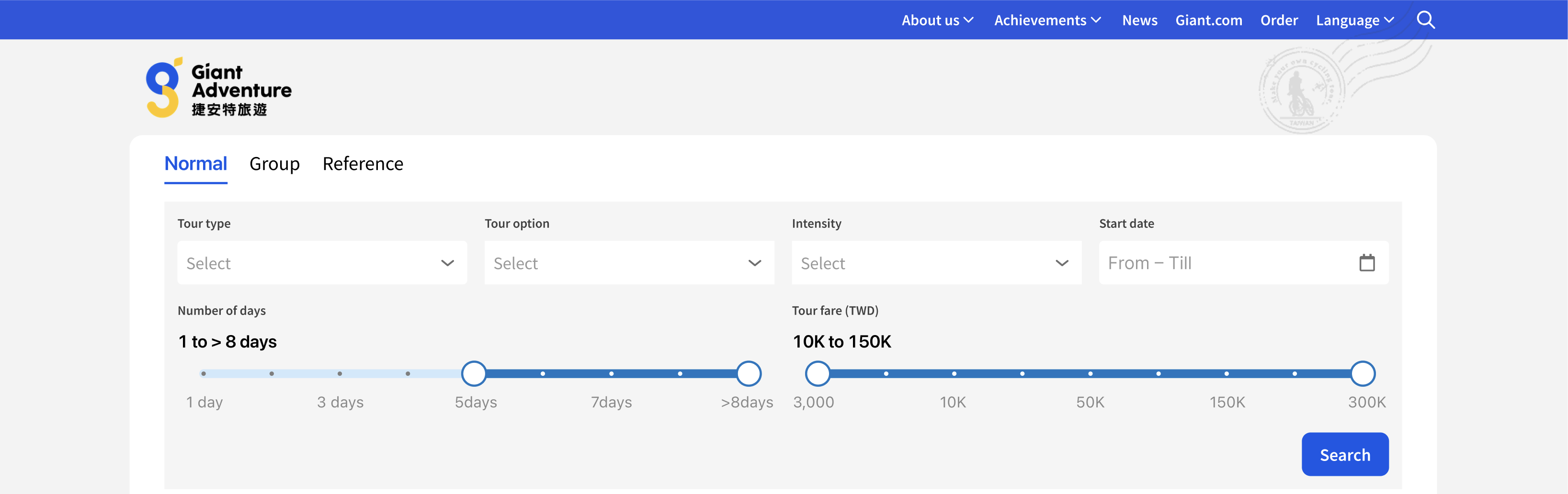
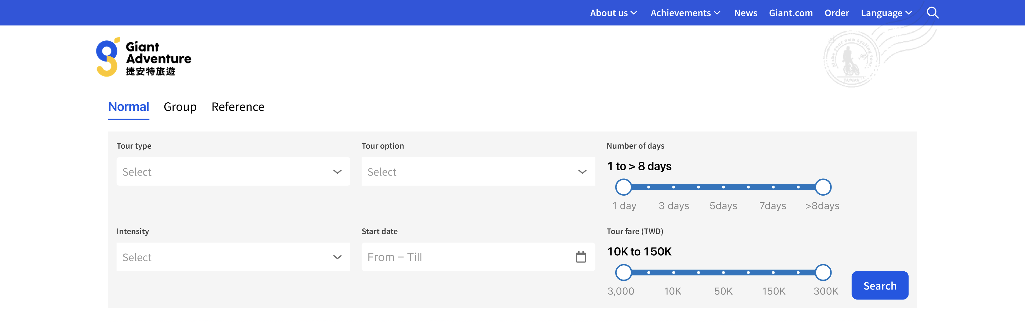
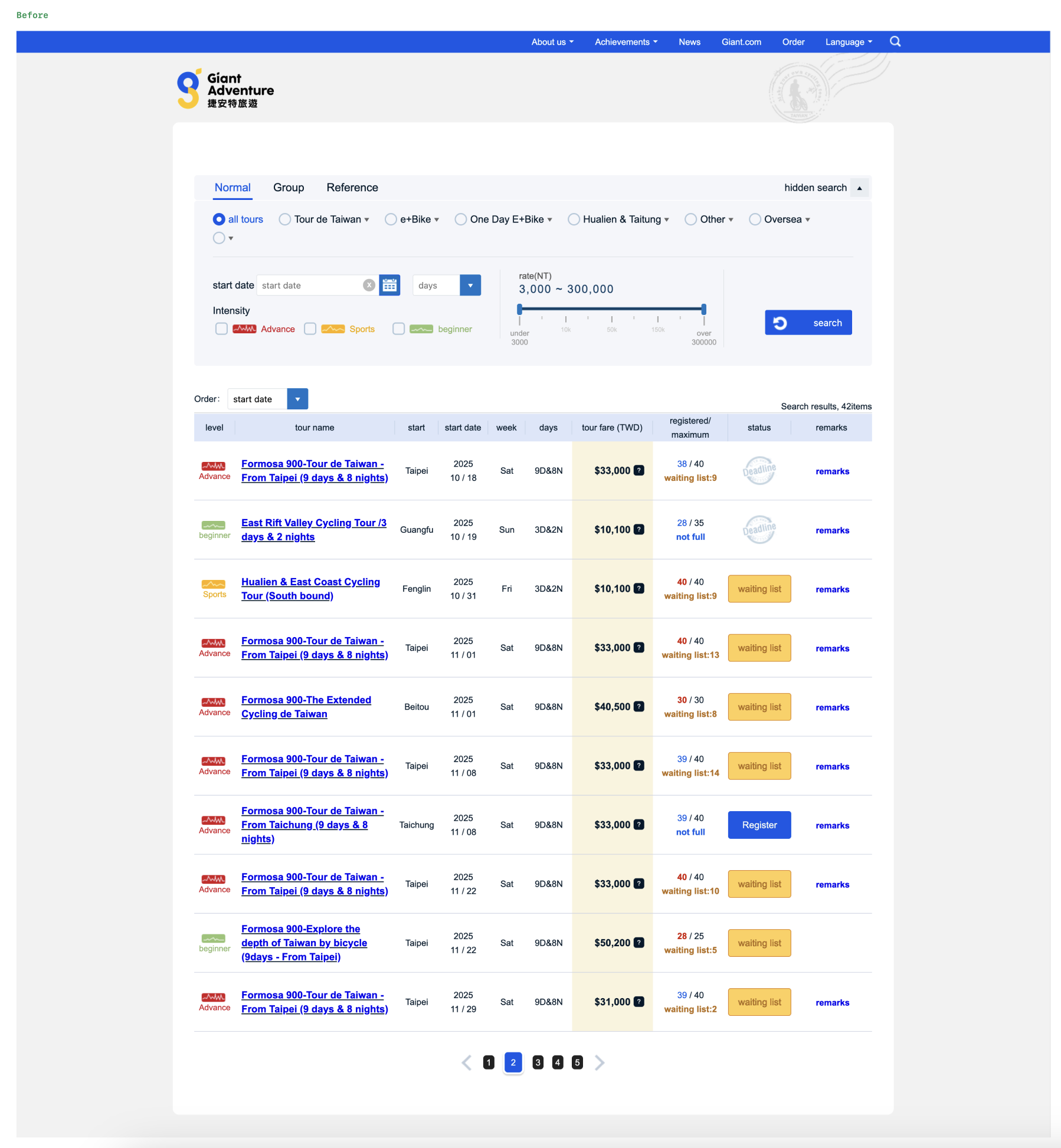
Problem 1: Confusing and Unscalable Tour Categories
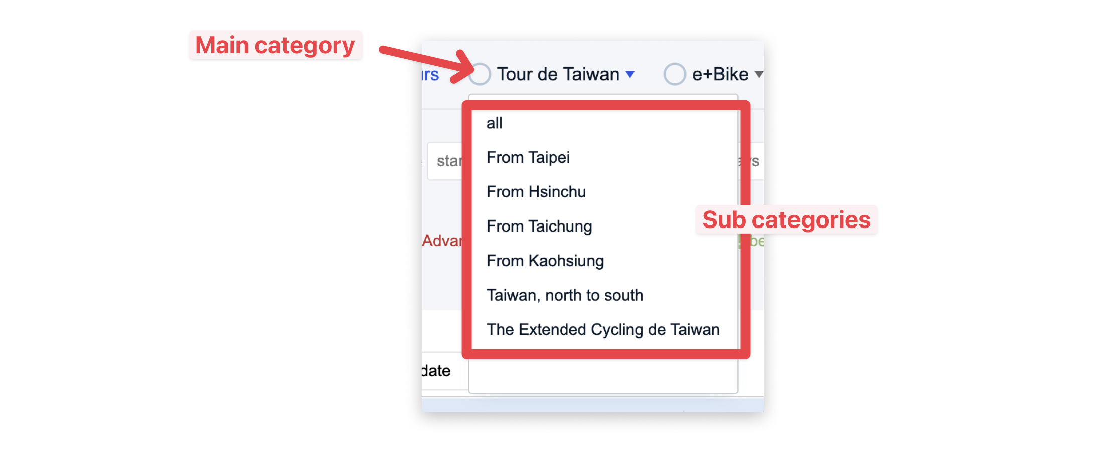
The cycling tours were classified by categories and sub-categories. For example, there was a category called "Tour de Taiwan" where you cycle the circumference of Taiwan in 9 days. Within it were sub-categories — From Taipei, From Kaohsiung, From Taichung, etc. — that indicated the flag-off locations.
Each category was listed as a radio-select field with a radio button beside it, meaning you could only select one category at a time. Within the dropdown options were the sub-categories with an "All" option selected by default.
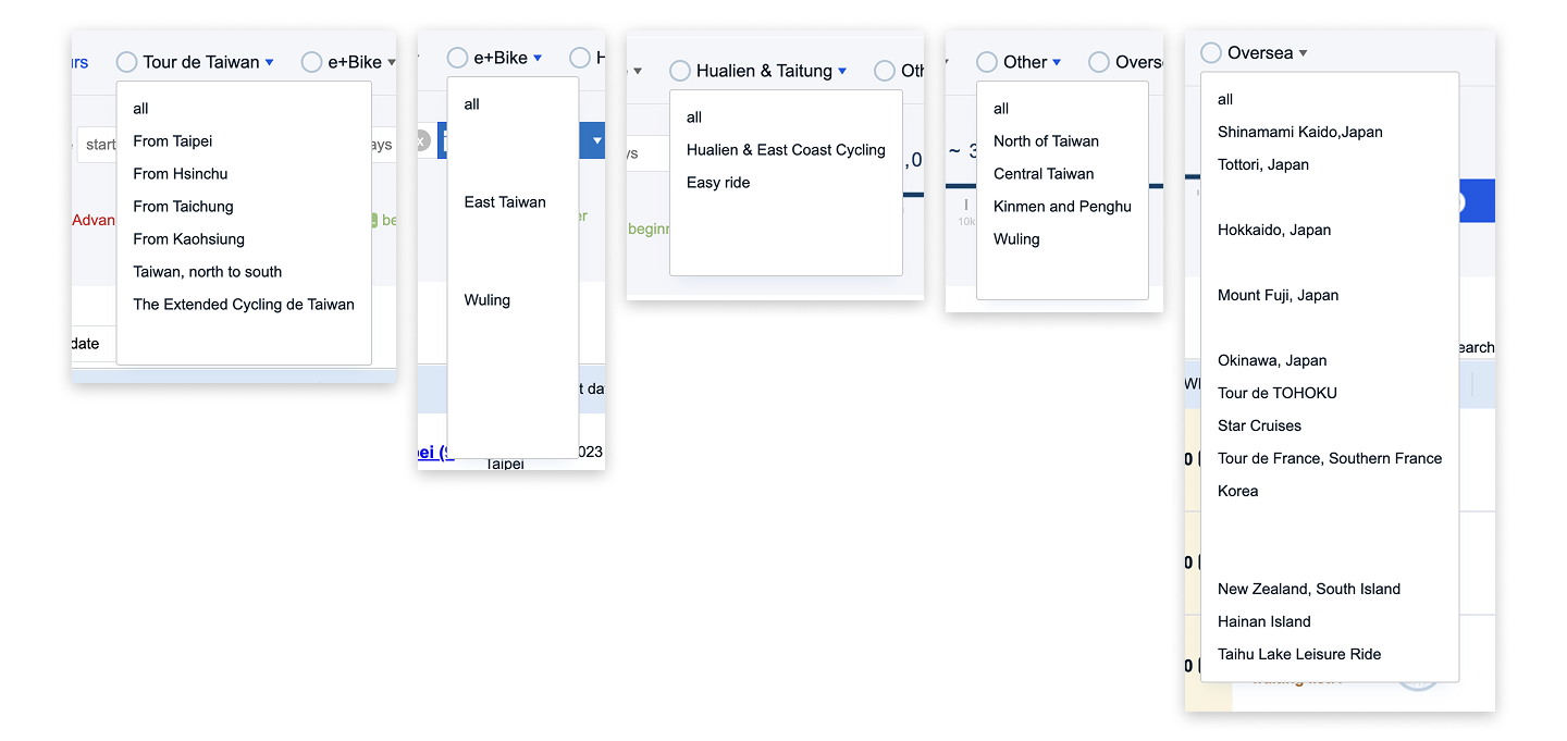
There were 6 categories already taking up 2 rows. If they expanded their categories, it would take up even more rows.
Solution A: Single combined dropdown
Before sketching out ideas, I listed down the main outcomes for category selection:
- When no category or sub-category is selected, display all tours;
- When just a category is selected, display all tours under that category;
- When a sub-category is selected, display just the tours under that sub-category.
The first idea was to group all the categories and sub-categories under one long single-select field, with the categories acting as dividers to visually separate them.
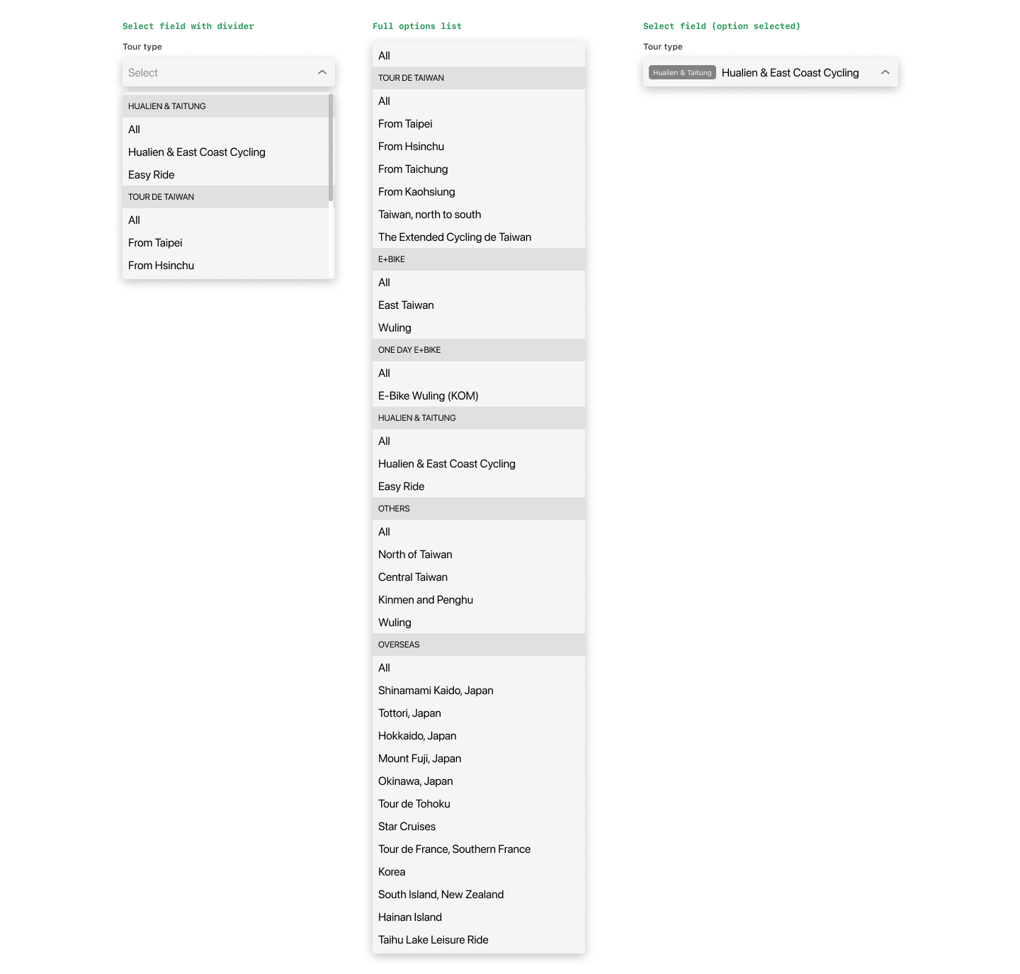
The problem: this list would be very long (11 + 5 + 1 + 2 + 4 + 11 + 3 = 37 items). Scrolling through it would be tedious.
I considered adding a search field inside the dropdown, but I think visitors — like myself — prefer to browse available options rather than search for a specific sub-category, especially when unsure what to look for.
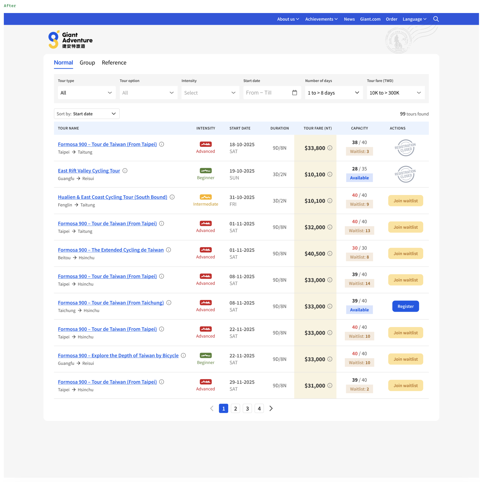
Solution B: Cascading dropdowns
The second idea is to have 2 single-select fields: the first for the main category ("Tour Type") and the second for the sub-category ("Tour Option").
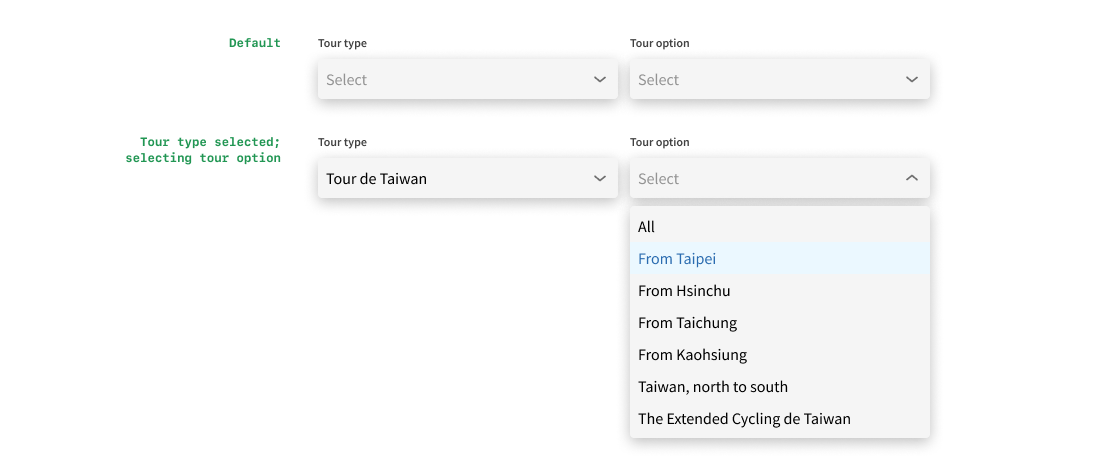
When no category is selected, the sub-category field is disabled. When a category is selected, the sub-category field becomes active and the visitor can browse its options.
This works better than Solution A as the list becomes manageable — not tediously long and no search field required.
We will always have only 2 select fields even when the organisation adds more categories, making it very scalable. We could even make the sub-category a multi-select field, allowing visitors to view tours from multiple sub-categories at once.
Problem 2: Conflicting Trip Duration Filter
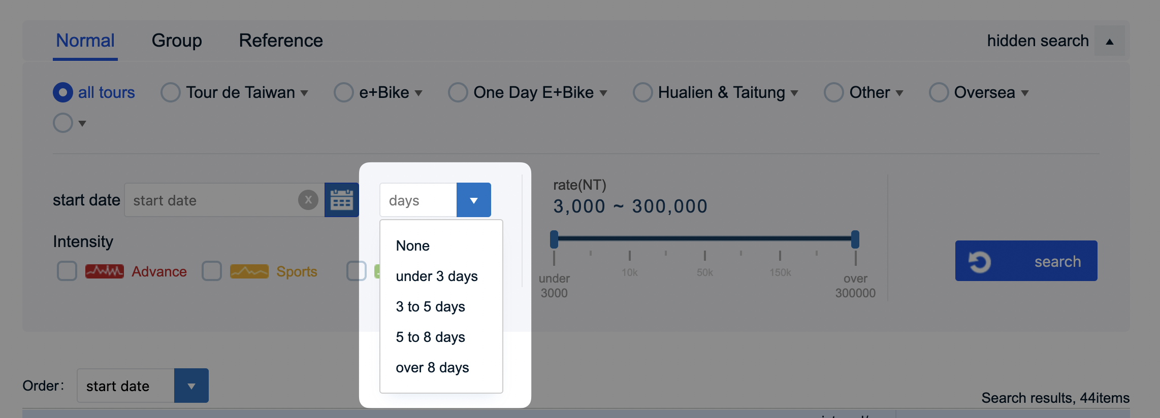
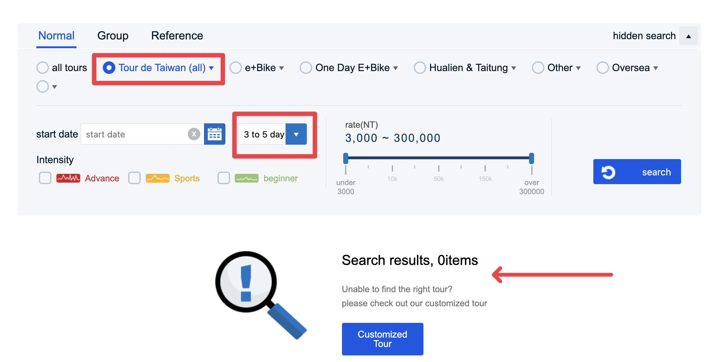
The trip duration filter offered fixed options like "< 3 days", "3–5 days", "> 8 days", etc., which worked fine on its own.
The problem arose when combining filters. Selecting "Tour de Taiwan" and then "3 to 5 days" returned no results because the two conditions conflicted: all Tour de Taiwan tours are 9 days long.
Solution: Range slider
Instead of a dropdown, I propose a range slider. This lets visitors fine-tune the minimum and maximum number of days, rather than being restricted by fixed options.
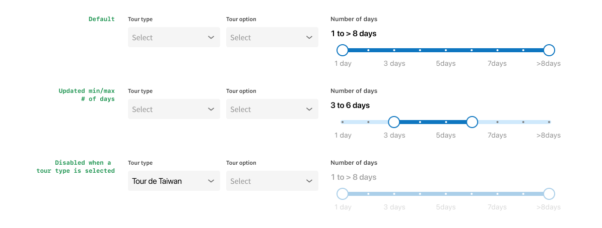
When no category is selected or if the category is "Overseas", the slider remains active — overseas tours vary widely in duration, so visitors need that flexibility.
When a category with fixed durations is selected (e.g., "Tour de Taiwan"), the slider becomes disabled since all tours in that category share the same duration. This assumes tour durations remain fixed per category; if that changes, the slider could stay enabled for all.
Problem 3: Intensity Checkboxes Consuming Too Much Space
The intensity options as checkboxes took up lots of horizontal space as the icons themselves were wide.
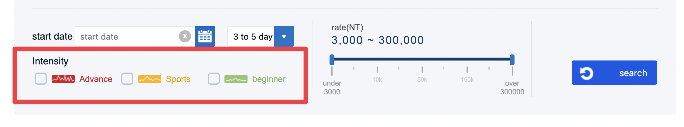
Solution: Multi-select dropdown with icons
Turn them into a multi-select field with shorter icons or simple illustrations. The illustrations are unique to this website and should stay.
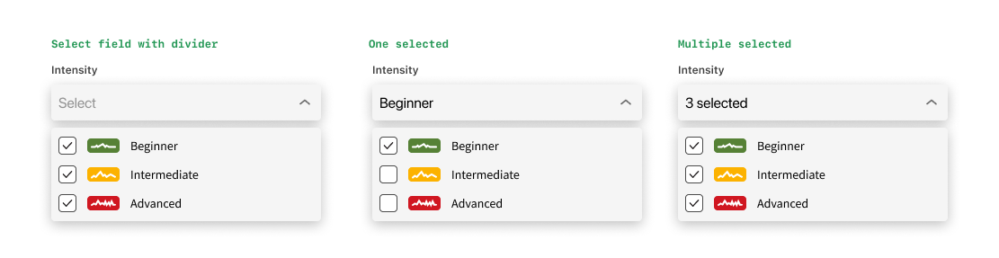
When only 1 option is selected, the field displays its name; when multiple are selected, it displays "X selected". This keeps the field compact without needing to display all the options at once.
Problem 4: Wasted Layout Space
The existing layout gave up lots of space at the top and both sides.
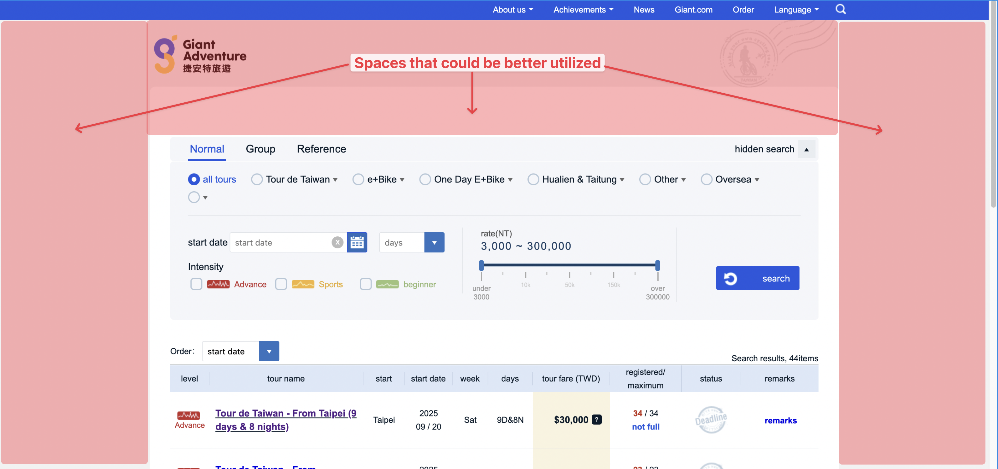
Solution: Horizontal filter bar
I initially wanted to move the logo up to the top nav, but that meant tweaking the logo colour because it blended into the background.
Instead, I kept the logo and background illustration but increased its width and reduced the top padding of the white container. I also pulled the tabs out of the search group so it is clear they are not directly related to the filters, and each tab could have different filter options.
I explored various ways of displaying the new options..
..but was not quite satisfied with the outcome. Until I saw how Carousell lined up their filter options horizontally in a single row.
The final version:
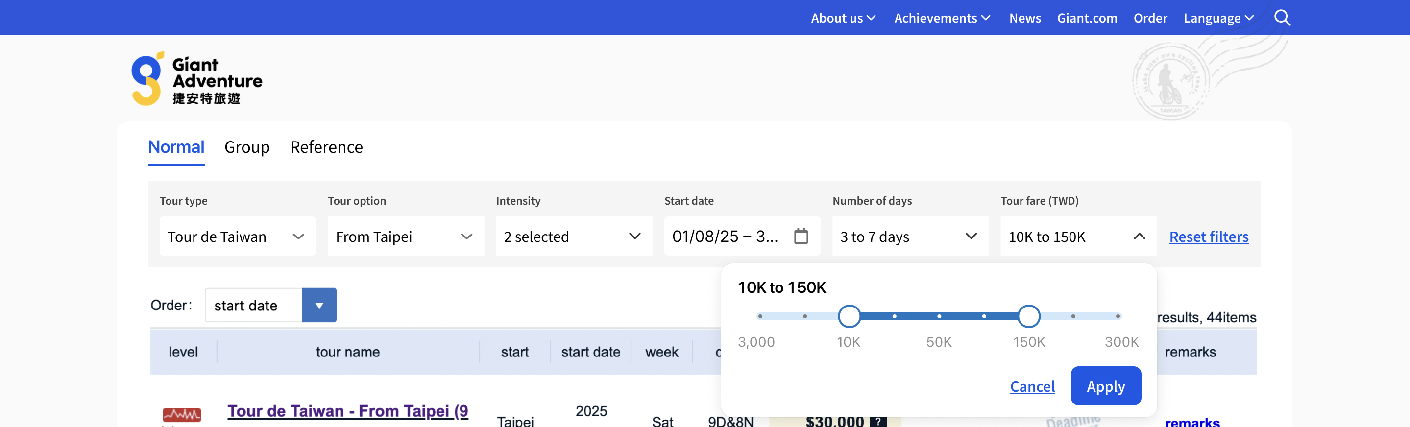
- Filter options lined up horizontally in one row;
- Removed the search button — results generate in real time as the visitor changes filter options;
- A "Reset filters" text button appears when at least one filter is active.
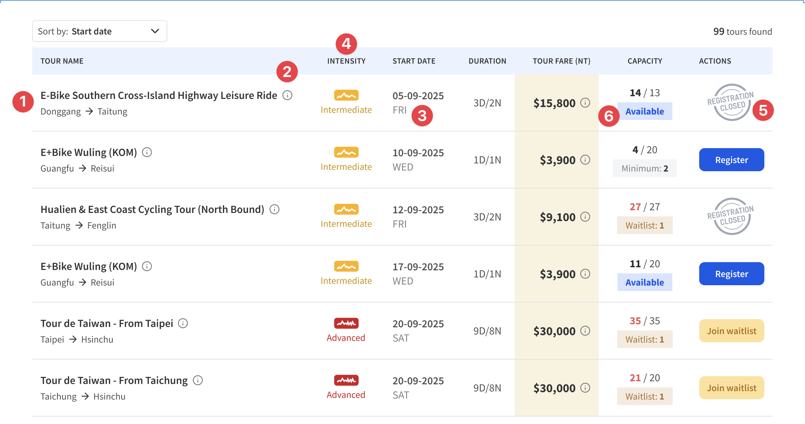
Problem 5: Cluttered Tour Results Table
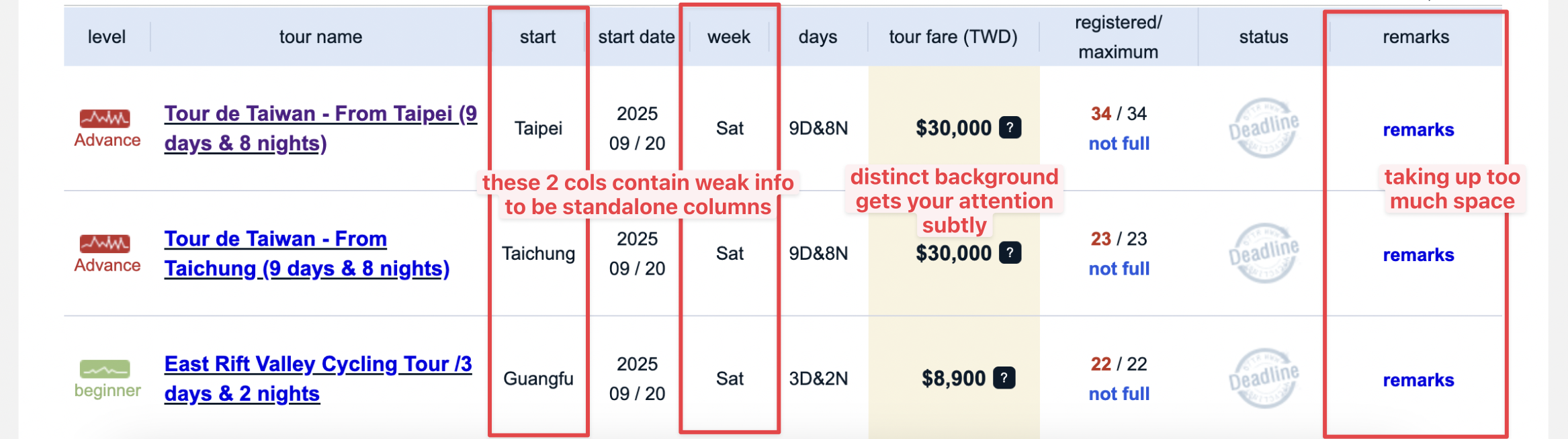
What I liked was that the "Tour fare" column had a distinct background colour that subtly draws your attention to it.
However, the remarks column took up too much space and the information was usually the same. The "Start" and "Week" columns were weak information that probably did not need standalone columns.
Solution: Consolidated table columns
- Give the "Tour name" column more space and show the starting and ending town name where possible;
- Place the remarks under an info icon next to the tour title;
- Combine "Date" and "Day" into one column;
- Move the "Level" column to the right of Tour name and rename it "Intensity";
- Refresh the illustration for "Deadline" (which was unclear) and change the copy to "Registration closed" (which is clearer);
- Tweak the info chip below the capacity.
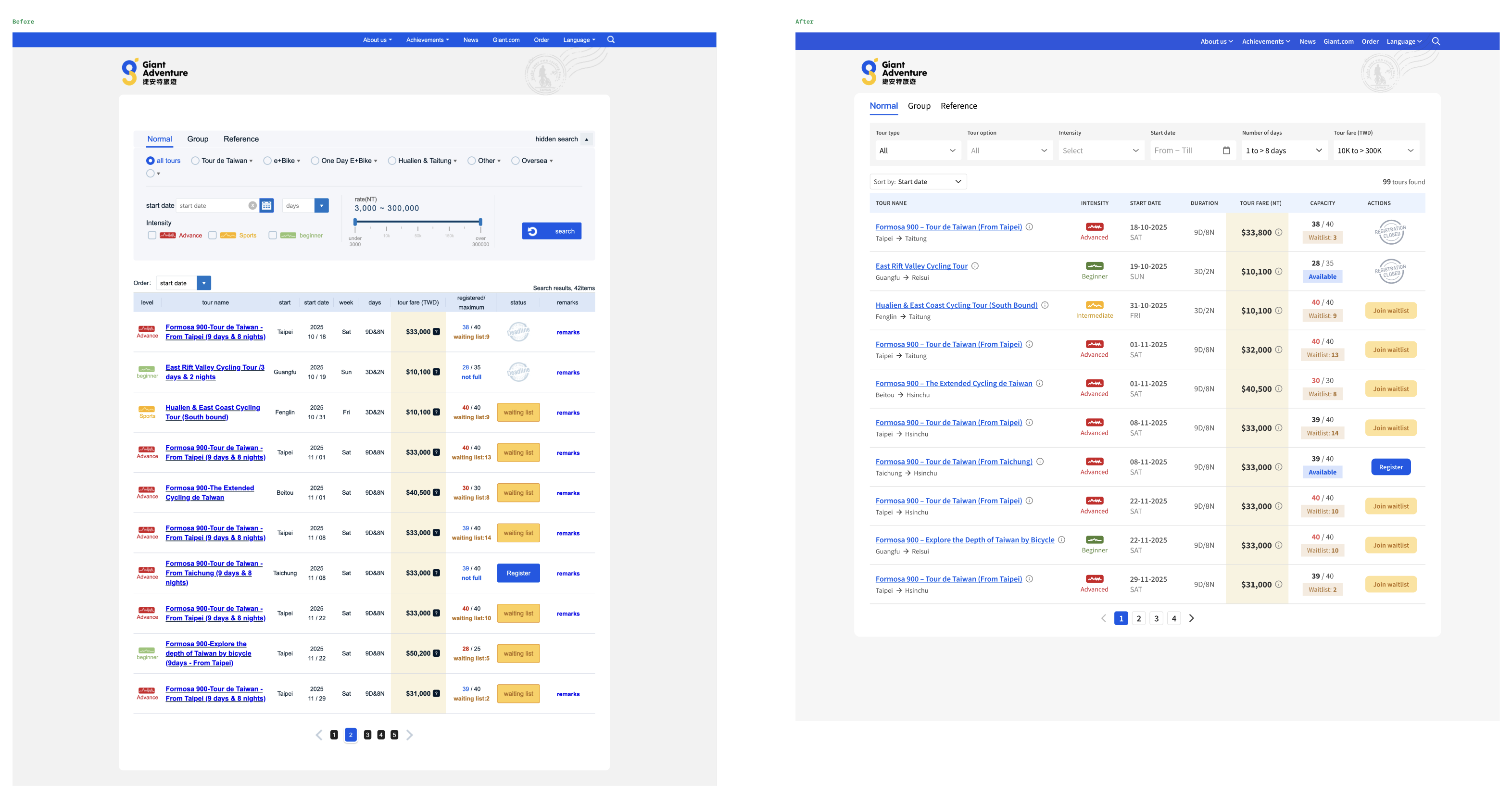
Before and After
Reflection
This was a fun exercise in re-imagining how a cycling tour site I visit regularly could better serve its visitors. The biggest takeaway was how a few structural changes to filters — cascading dropdowns, a range slider, and a horizontal layout — can meaningfully reduce friction in a search-heavy experience without sacrificing any functionality.