HR · B2B
Performance Module
Designing a performance review and goal-tracking experience for a multi-tenant B2B HR platform.
Context & Challenge
OmniHR needed a performance review module to give organisations a reason to consolidate onto the platform — both as a migration incentive for new clients and a retention lever for existing ones.
The module allows organisations to create review templates, launch review cycles, and manage multi-directional feedback across employees, managers, peers, and subordinates.
- Key entities: Templates → Cycles → Review phases
- Personas: Admin, Reviewee (Employee), Reviewers (Manager, Peers, Subordinates)
The core design tension: giving admins powerful configuration options while keeping the experience clear and trustworthy for end users. A reviewee or reviewer seeing the wrong information at the wrong moment breaks trust in the entire system.
Strategic constraint: this module needed to meet the majority of use cases without becoming a standalone appraisal product — so every feature decision was a trade-off between depth and simplicity.
My Role & Impact
- Role: Led design end-to-end — research, competitive analysis, wireframing, interaction design, UI design
- Duration: 5 iterations over 2 years, scaling from 2 review types to 4, then integrating with Goal Setting
- Team: 1 Designer (me), 2 PMs, 4 Devs, 2 QAs
Key contributions
- Drove the visibility rules framework that became the foundation for how all review responses are surfaced — using checkboxes and switches just weren't enough for admins to easily comprehend and set up; the final matrix layout was the outcome after numerous design iterations and reviews.
- Proposed to keep goal setting and competencies selection out of the first 2 iterations as they were complex already; including them would delay release deadlines to meet the year-end quarter when most annual reviews occur.
- While I wasn't able to ascertain the exact number of new logos that signed up with OmniHR due to this module, I gathered from the sales team that the improved appraisal module incentivised them hugely.
Process & Collaboration
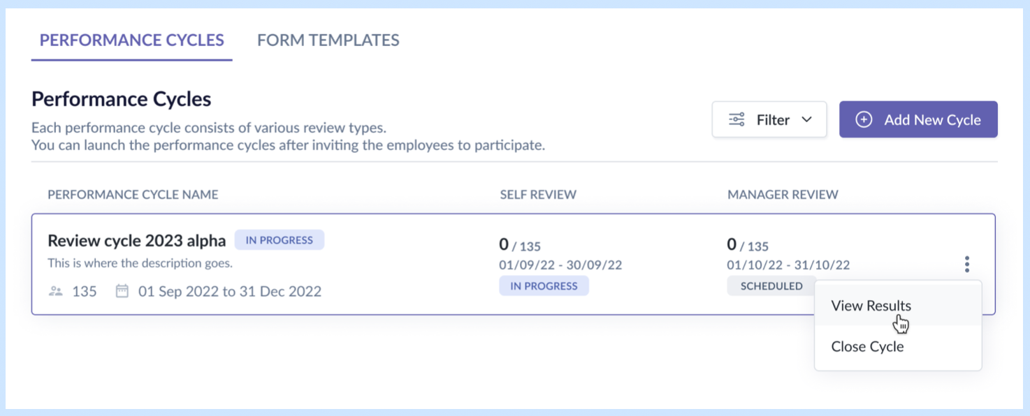
- Started with competitive analysis across 3 appraisal tools — identified gaps we could exploit (all required the review cycle to run at a fixed order and display the review form in a particular sequence; we made ours 100% flexible) and features we needed to match to be credible (e.g. the ability for managers to lock the peer selection from further editing).
- Defined scope for each iteration collaboratively with PMs and stakeholders. For example, in the first 2 releases, I proposed to keep sections like competencies and goal setting out of scope. Those were dedicated sections with their own step in the review cycle creation flow, which typically happened at the beginning of the cycle. These unknown complexities around their placement in the cycle would have delayed release.
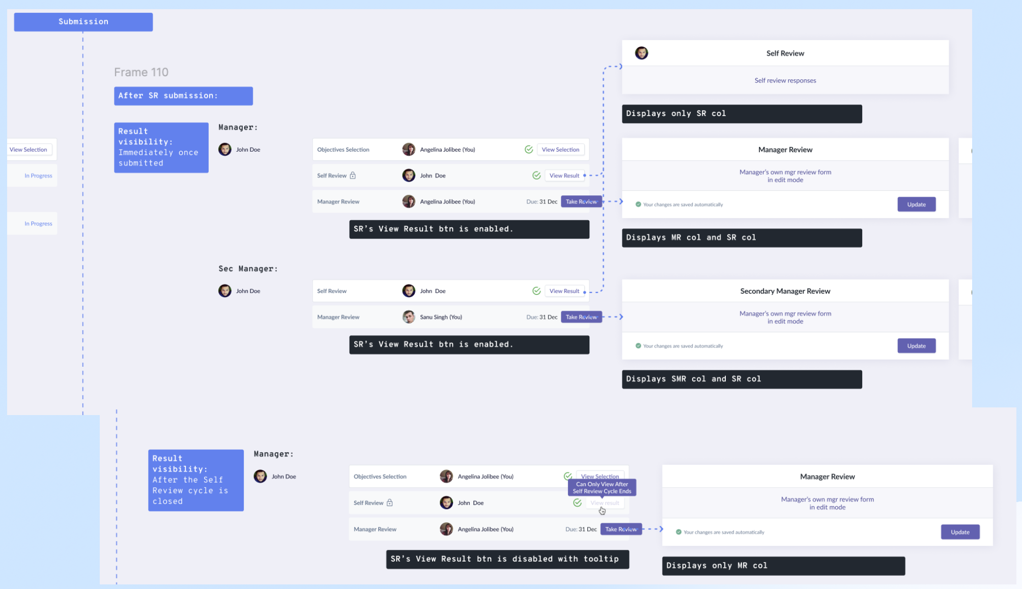
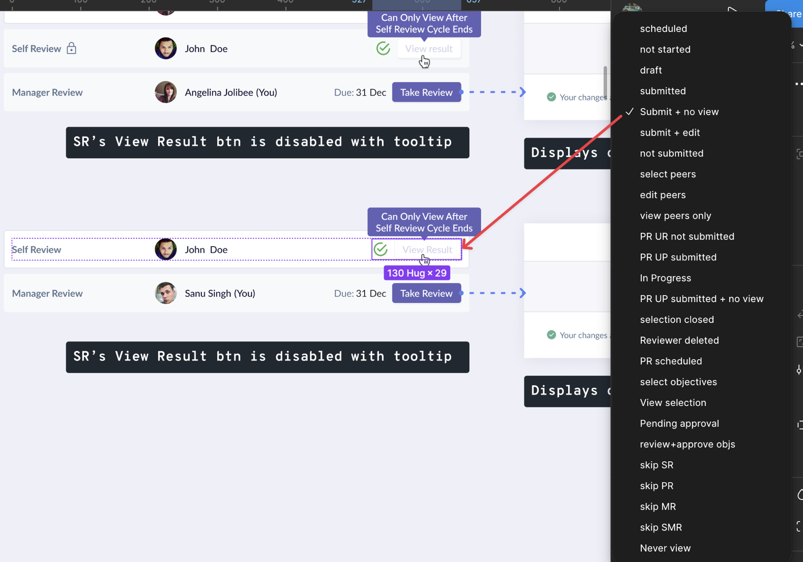
- Mapped end-to-end user journeys for all personas before jumping into screens. This surfaced edge cases early — particularly around visibility timing — and saved rework downstream.
- Validated designs by reviewing with PMs and frontend developers early to ensure the logic is sound and solution is reasonable for the timeline. Ran usability tests with colleagues to run through the flows with fresh pairs of eyes to surface confusing areas.
- Moved to hi-fi designs and created dev handoff presentations to align on interaction details and reduce back-and-forth during implementation.
Key Design Decisions
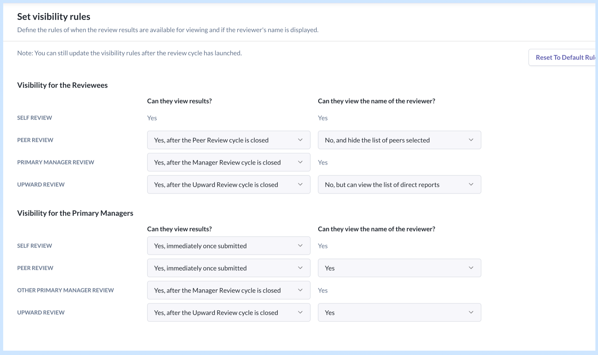
1. Visibility Rules Framework
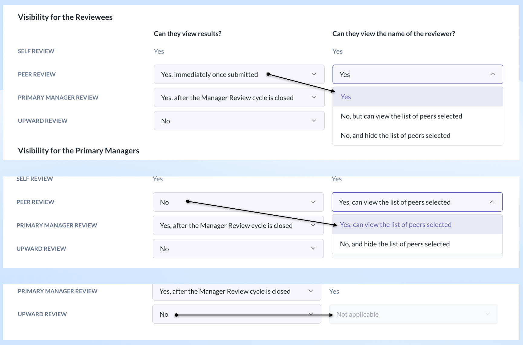
Situation: Expanding from Self & Manager Review to include Peer & Upward Review introduced a new problem — whose responses can the reviewee and manager see, when, and whether reviewer identities are anonymous.
Options considered:
- Option A: Using checkboxes and toggles with progressive disclosures per user role. This resulted in a very long form with repetitive labels which weren't clear and intuitive enough for admins to configure easily.
- Option B: Display all the options in a 2-column matrix, grouped by user roles. It removed repetitive labels and the admin could see how one field influenced the other.
Decision: Introduced a two-layer visibility configuration in the review cycle creation flow:
- "Can they view results" — lets the admin choose whether reviewee and manager can view each persona's responses, and when.
- "Can they view the name of the reviewer" — controls identity anonymity per persona.
For certain persona combinations, the first setting constrains the options of the second — reducing admin error.
How we got there: Mapped out all visibility scenarios across the 2 main user roles (reviewee and reviewing managers). These maps doubled as alignment tools with PMs and devs — we used them to agree on interactions and views before building.
Rationale: It helped to visually explain how the configurations impacted the downstream displays instead of using text and tables, and also demonstrate the state changes over time for each of the user roles. It mitigated the risk of misinterpretation of the fields.
Result: Reusable component system that scaled across review types, reduced development and QA time, and reduced admin configuration errors.
2. Redesigning for Multi-Review Types
Situation: The original UI was designed for only self and manager reviews. Adding peer and upward review meant up to 5 review types + 2 selection periods per row — the existing 2-column card layout couldn't accommodate this.
Options considered:
While I got a general sense that a 2-row layout was the way to go, I played around with various formats for the row displaying status and progress. One version focused on the active phase, another visualized as a stepper. Those earlier variations were discarded as they lacked clarity on the period and progress.
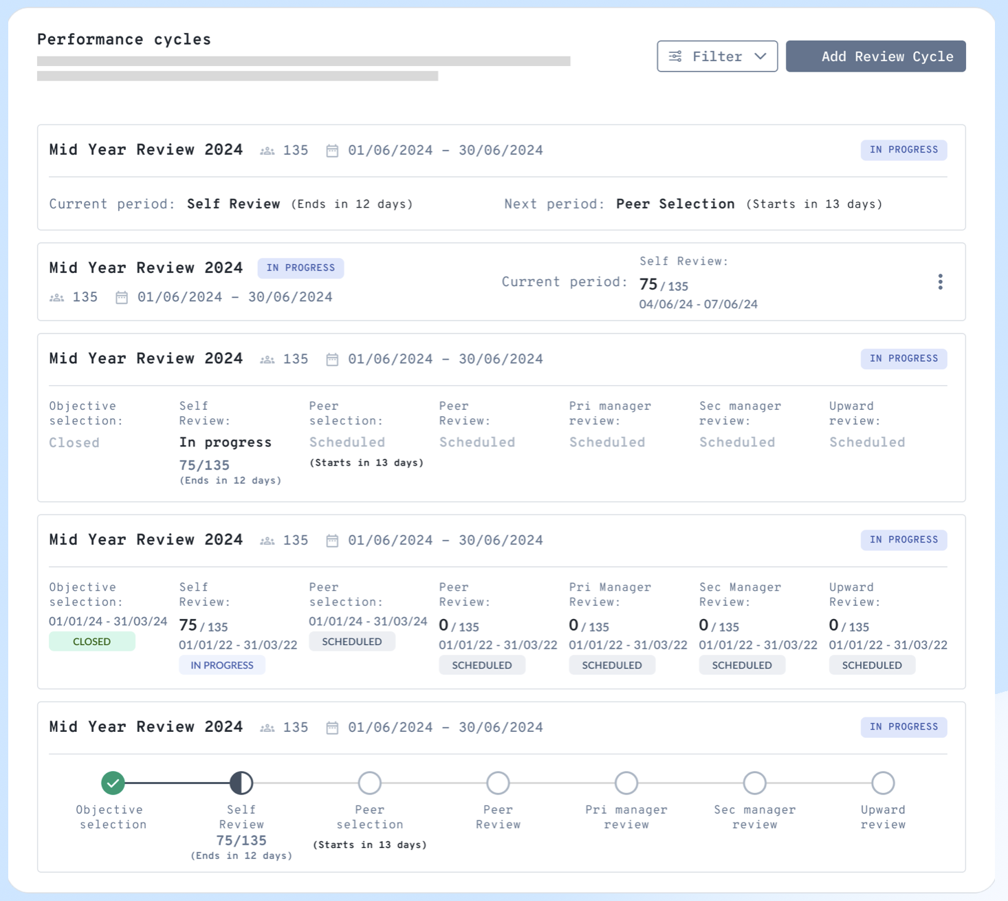
The fact that phases were displayed in a particular sequence didn't mean the actual cycle ran in that same order, so it was important that the design carried all the essential details to make sense to the admin even if she was just skimming over them.
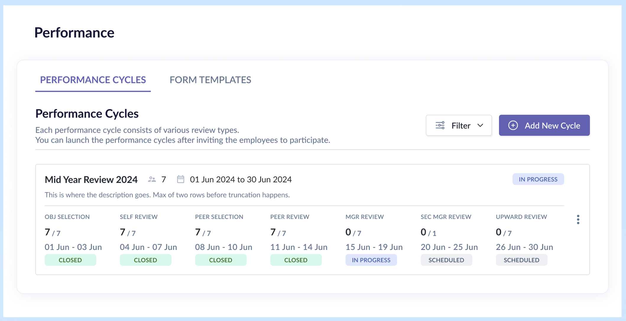
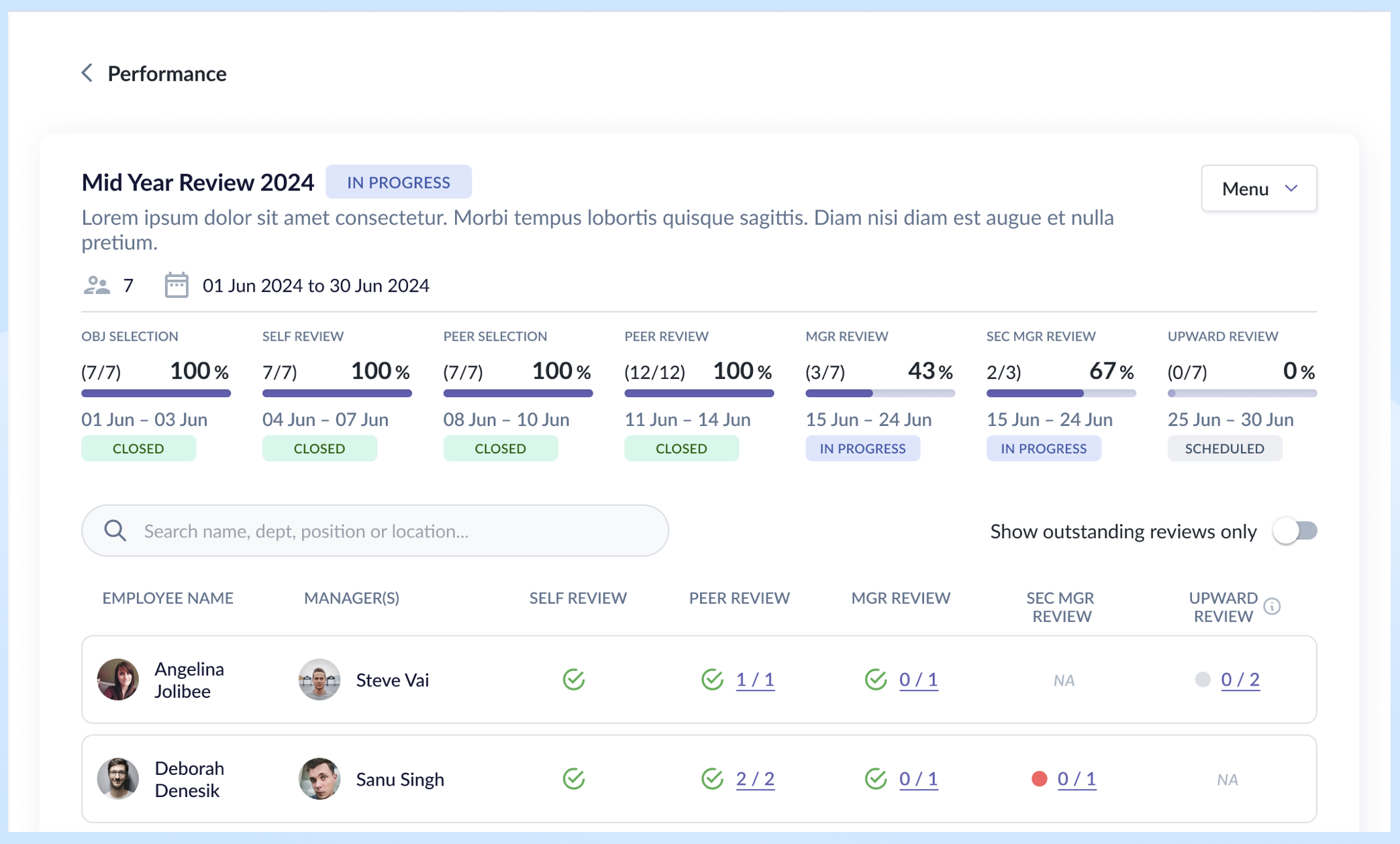
Decision: Revised to a 2-row card layout:
- Row 1: essential performance cycle details
- Row 2: statuses of selected review types for the cycle
Other changes:
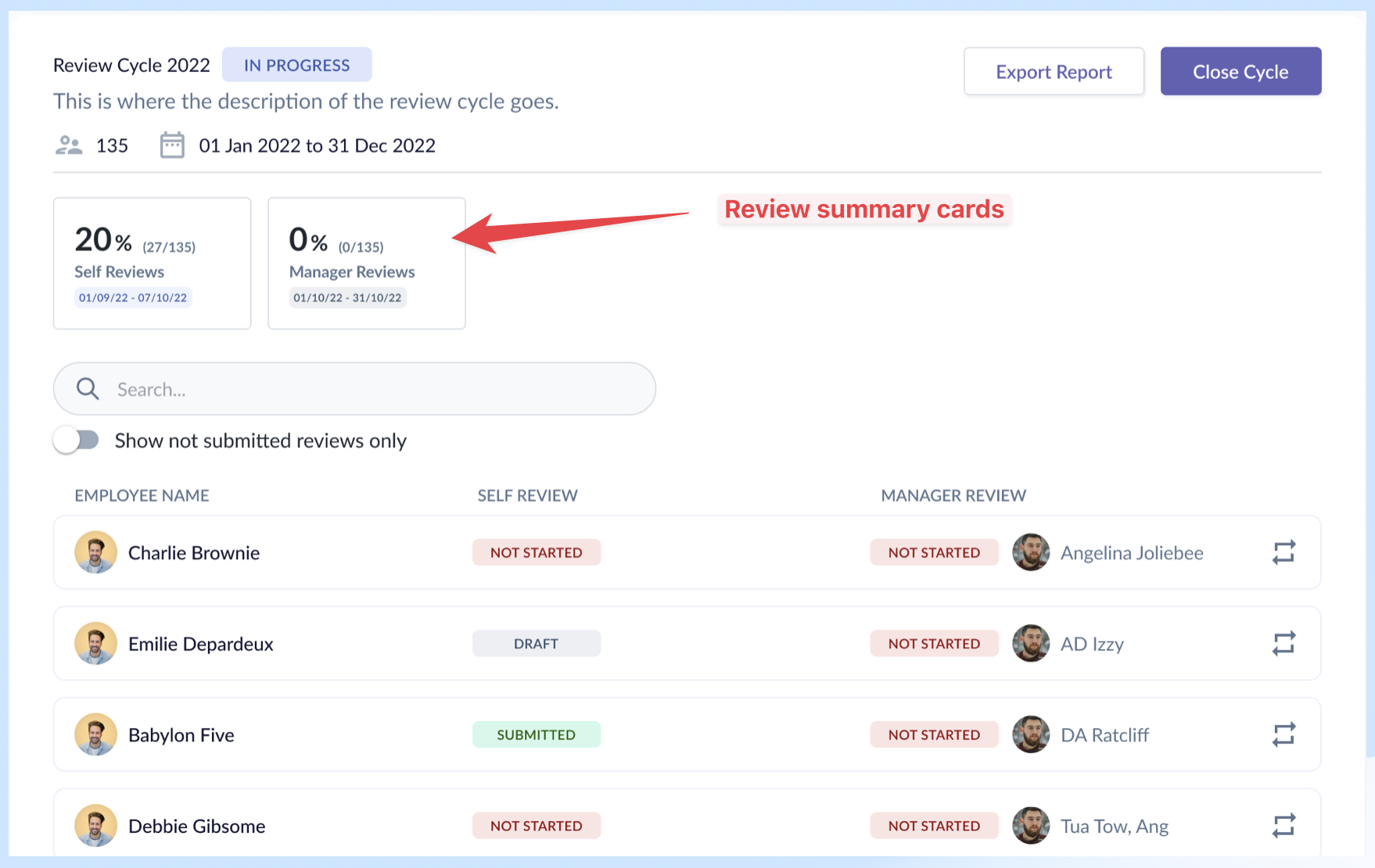
- Introduced a progress bar combining absolute numbers and completion percentage on the event details page — giving admins both the "how many" and "how far along" at a glance.
- Increased spacing between review period and status for better scannability.
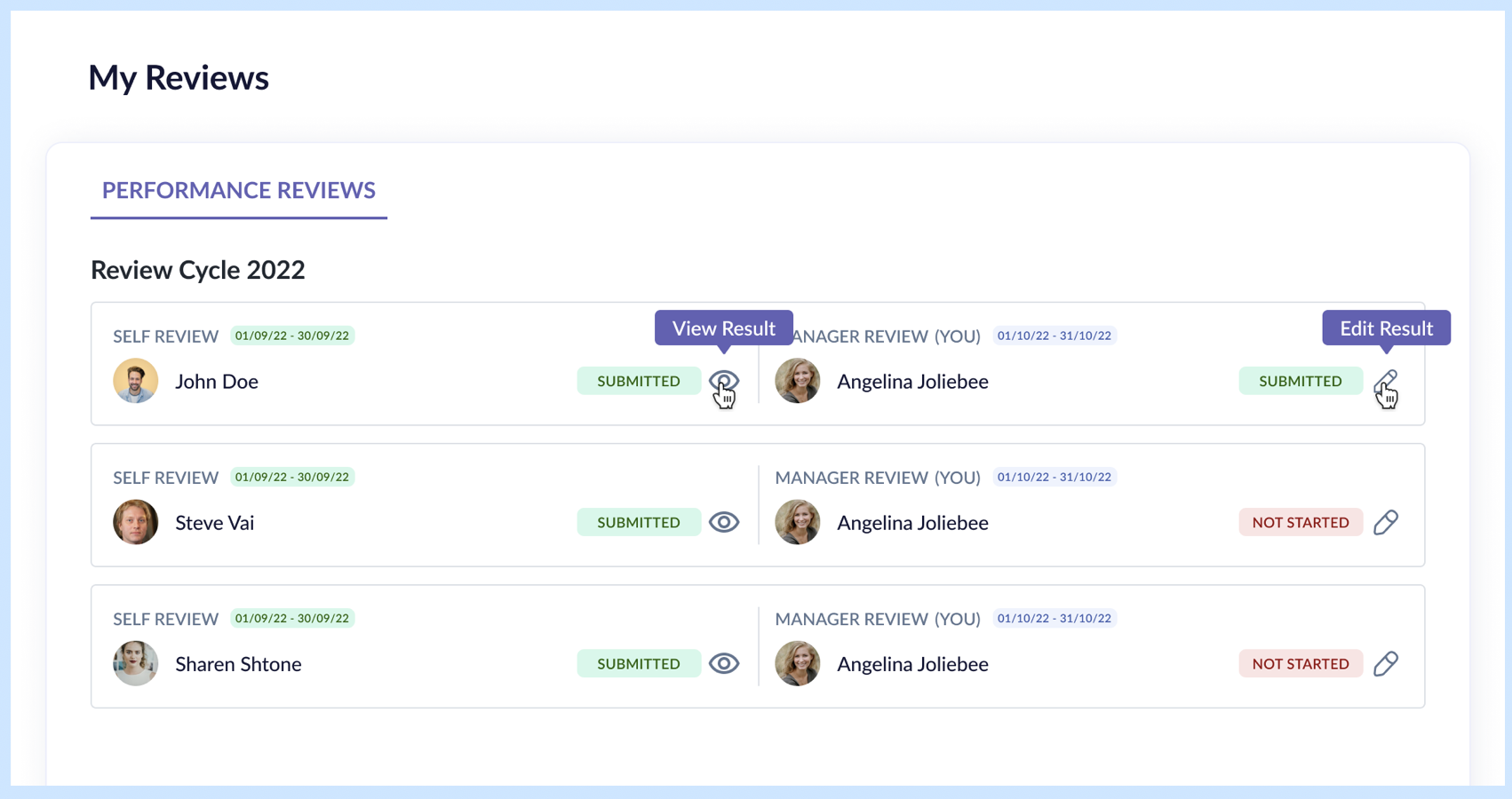
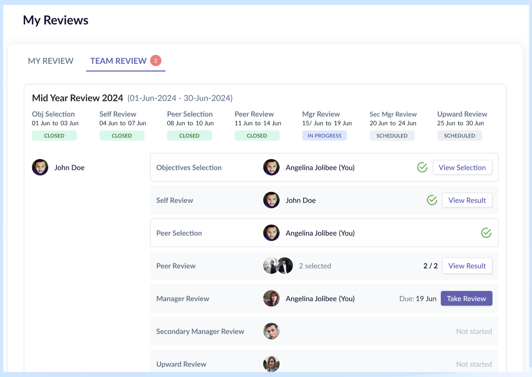
- Split the task page into "My Review" (reviews and responses about me) and "Team Review" (reviews and responses for subordinates, peers, and direct managers) — separating personal and managerial contexts.
- Within each tab, the review cards are stacked vertically for each persona.
Rationale:
- 2-row layout with all essential details: Admin needs to feel they are on top of every aspect of a performance cycle, and by providing them with that information, they know they are in control.
- My Review / Team Review split: It was driven by the fact the two tabs handled two different scopes, thus the need to split them up. It worked well with the user's mental model of "myself" vs "others". "Others" in this case is all employees within my team – my direct reports, my peers, my direct manager.
- Vertical stacking of review types: Better scannability of the different review types, employees involved, the status and CTAs, as the columns are aligned. All they need to do is look to the right side for the primary buttons to know which reviews required their actions.
Result: By designing with all the review types and selection phases in mind, we ensured that the design worked also for the worst-case scenario. Vertical stacking of review types allowed scalability for future review types, like secondary manager review, goal setting phase, etc., with minimal effort.
Reflection
What I'd do differently
- Use a different layout for the My Review and Team Review cards to reduce wasted space.
What the system still can't do cleanly
- Handle cases where employees miss deadlines or need individual deadline extensions — this still requires backend intervention.
- By providing admins the function to extend deadlines, either individually or in bulk, we could free up the backend developer's time.
What I learned
- Key takeaway: Designing the performance module required me to work within strategic constraints to balance admin power vs. end-user simplicity.
- Implementing the visibility matrix allowed the admin to have full control over who sees what and when, which enabled the success of this module.
- By keeping goal setting and competencies out of scope, we were able to focus on the complexities of the crucial review cycle and meet the timeline.