HR · B2B
Time Off Module v2.0
Redesigned leave request and approval workflows with multi-level parallel approvers, plus a full overhaul of the time off experience.
Context & Challenge
OmniHR needed to enhance the time off module with multi-level parallel approvers and a redesigned time off tab. Since the release of the first iteration, clients had been requesting more features in the time off module, with parallel approval flows at the top of the list. Some deals were lost due to the lack of this feature — time was ripe for the 2nd iteration.
Key entities: Approval flows → Submissions → Approvals
Personas: Admin (configures approval flows), Employee (submits time off, tracks approval status), Manager (approves requests)
The core design tension: giving employees clarity of their time off balances while maintaining the flexibility to view their time offs either in visual or listing mode.
Strategic constraint: this module's release needed to meet timeline pressure and stay consistent with existing approval elements — so the tradeoff was exploration and execution time.
My Role & Impact
Role: Led design — research, wireframing, interaction design, UI design
Duration: 3 months | Team: 1 Designer (me), 2 PMs, 3 Devs, 2 QAs
Key contributions:
- Proposed the redesign of the time off page, which included calendar/listing toggle, time off summary cards, and improved layout hierarchy.
- Drove the redesign of approval flow modal that allowed the admin to define the scope with time off policies as additional criteria, and parallel approvers per level.
- Although we used existing approval status elements from the expense module, I proposed some visual tweaks to reduce the component variants to save dev/QA time.
- After shipping this iteration, we got positive feedback from customers citing the upgraded approval flows and refreshed UIs in the time off tab during bi-weekly calls with the sales and customer success team — a good indication that we were shipping features that met customers' needs.
Process & Collaboration
- Audited all existing time off screens to identify which needed redesigning to support the new parallel approver feature.
- Mapped out all approval progress scenarios — including edge cases where approvers were deleted or dismissed mid-flow — to surface complexity before jumping into screens.
- Looked at competitor implementations for the summary cards, or referenced patterns from the Expense module for the approval statuses in the row items and the details page.
- Explored various layouts and discussed trade-offs with PMs and stakeholders before converging on the final direction. Conducted usability tests with colleagues when deciding between options.
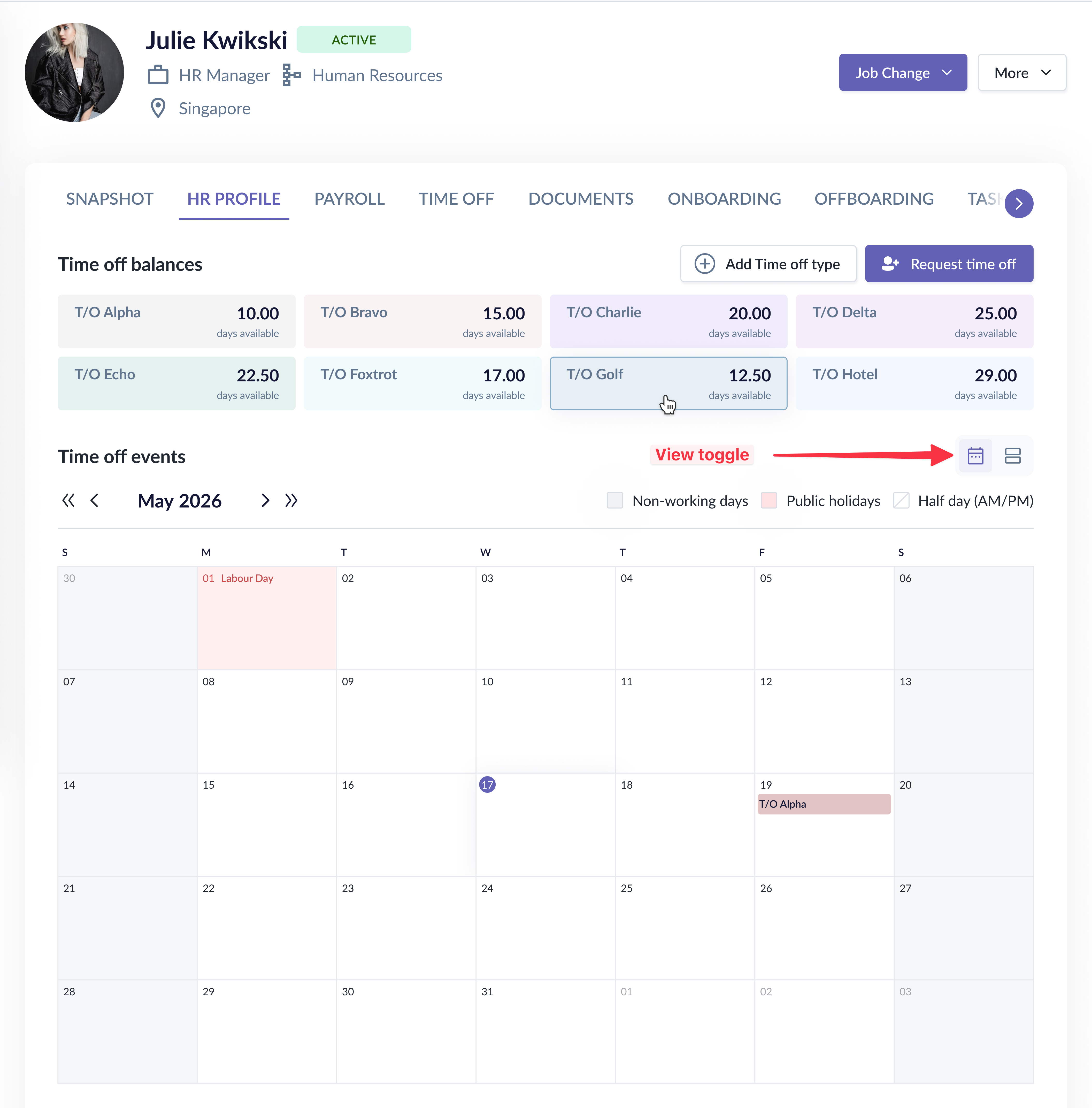
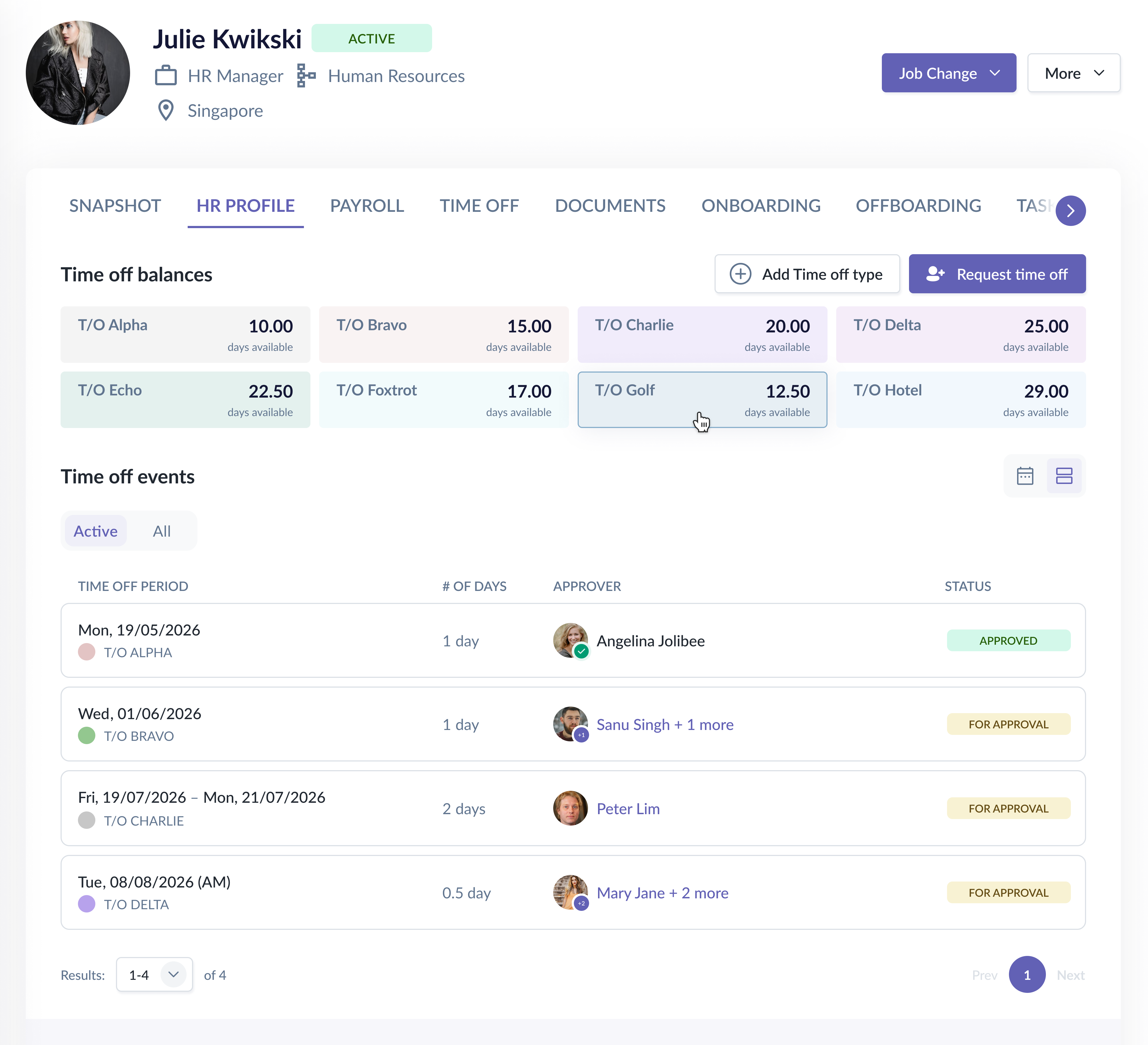
Decision 1: Calendar vs. Listing View Toggle
Situation
The upgraded approval flow meant employees now needed to see approval status details — but the existing calendar view had no room for this, and the calendar space itself was already compromised by balance cards.
Options Considered
- Time off balances still on the right side; toggle on existing calendar. While it was less dev effort as we would be using a similar layout, the listing table has much less width.
- Side panel for status details: Users would need to click on time off requests to view details. Not useful for events months into the future; toggling the calendar forward was a hassle just to view the status.
- Time off balances on top; both calendar and listing table visible below. Calendar and listing table serve the same purpose, thus it was rather redundant to display them both.
Decision
- We finalized on the version with the balance cards on top and a toggle to switch between calendar and listing views.
- The calendar view was fully optimized for available space, while the new listing view showed all active (ongoing or upcoming) time off applications with approval status, approver details, and progress.
Rationale
- Employees needed two distinct mental modes: "when am I off" (calendar) vs. "what's the status of my requests" (listing). A toggle lets them switch contexts cleanly rather than via the other options.
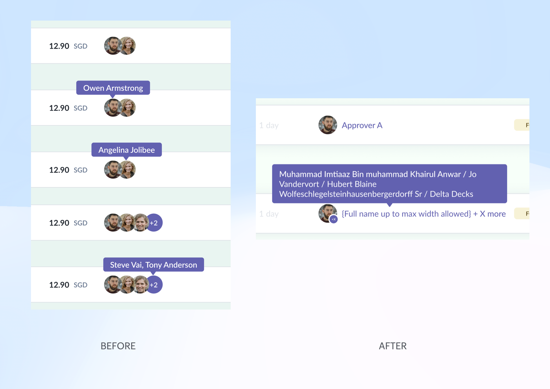
Other changes
- Previously in the Expense module, there were variants and interactions for the different number of parallel approvers. And when implementing here in the time off module, the QA needed to test them all again.
- I reduced them to having only 2 variants to save on dev/QA effort: single and multiple approvers. The interaction was also simplified to show all the approver names on hover.
Result
- Employees have control over what they wish to see — who the approvers are, where it's stuck, and who to follow up with.
- Reduced dev/QA effort by half; simplified design system maintenance
Decision 2: Parallel Approver Flow
Situation
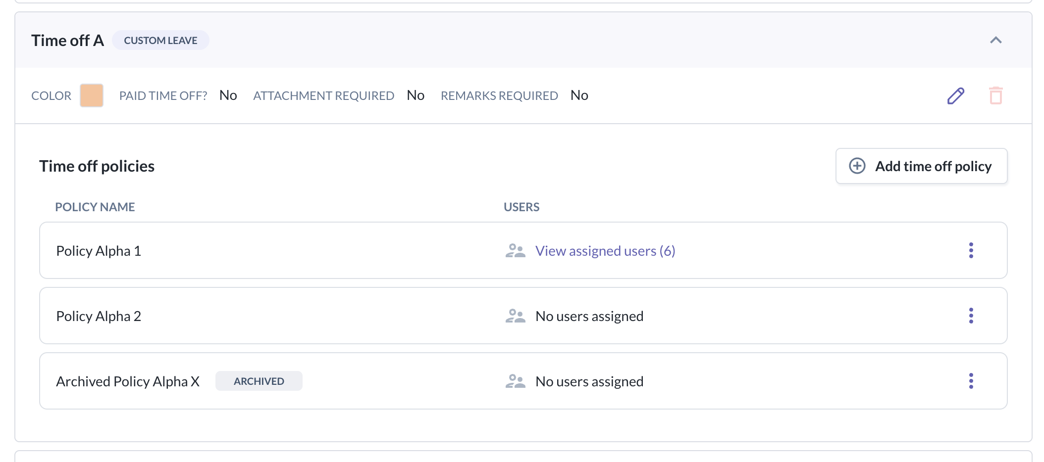
In the previous version, each approval level could only have a single approver that covered everyone — not powerful enough to cater to the different needs of the organization.
On top of that, the time off module has the concept of time off type and policy (where a type can have multiple policies) — a concept that didn't exist in the Expense module, so the existing approval flow setup couldn't handle it out of the box.
Options Considered
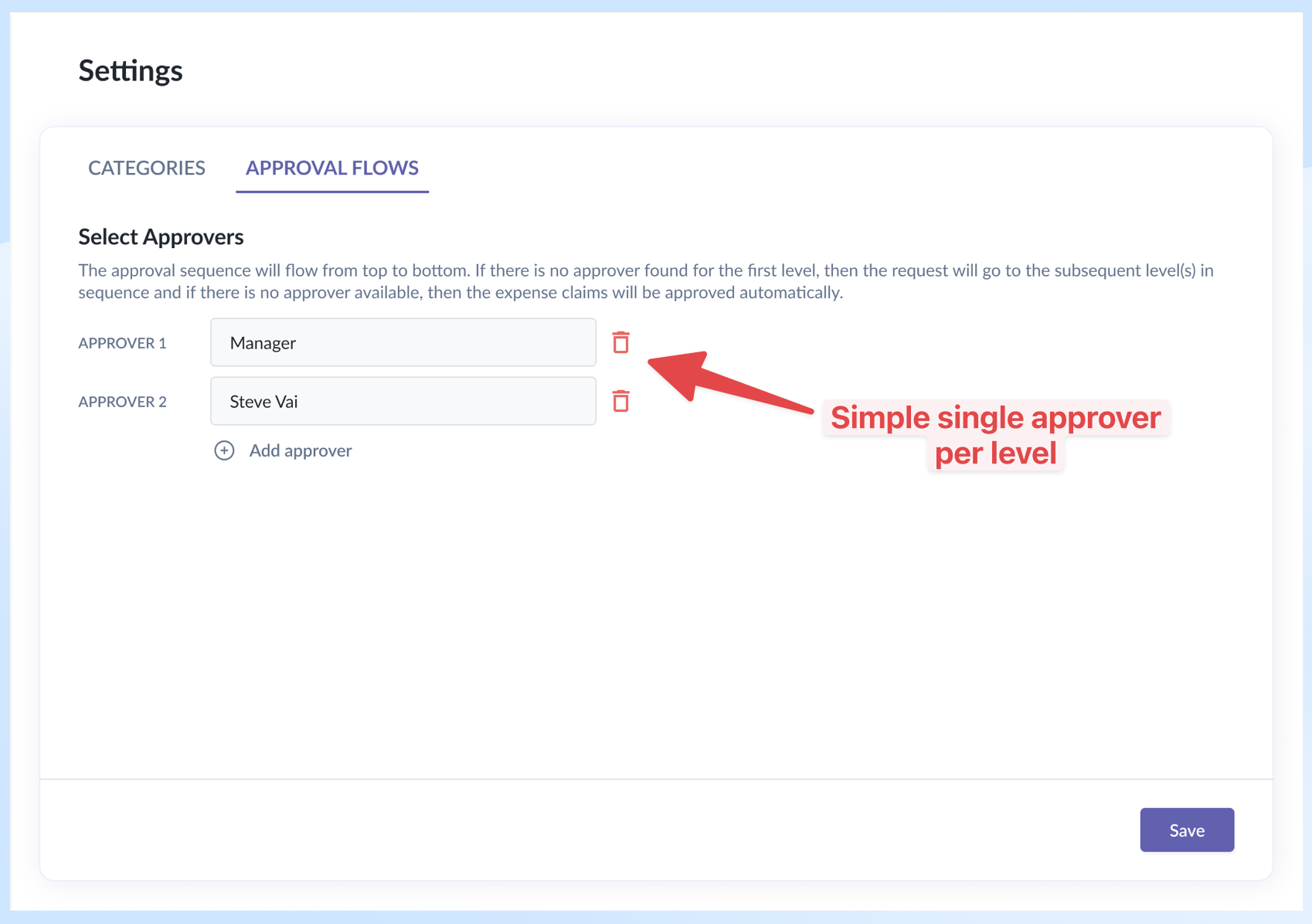
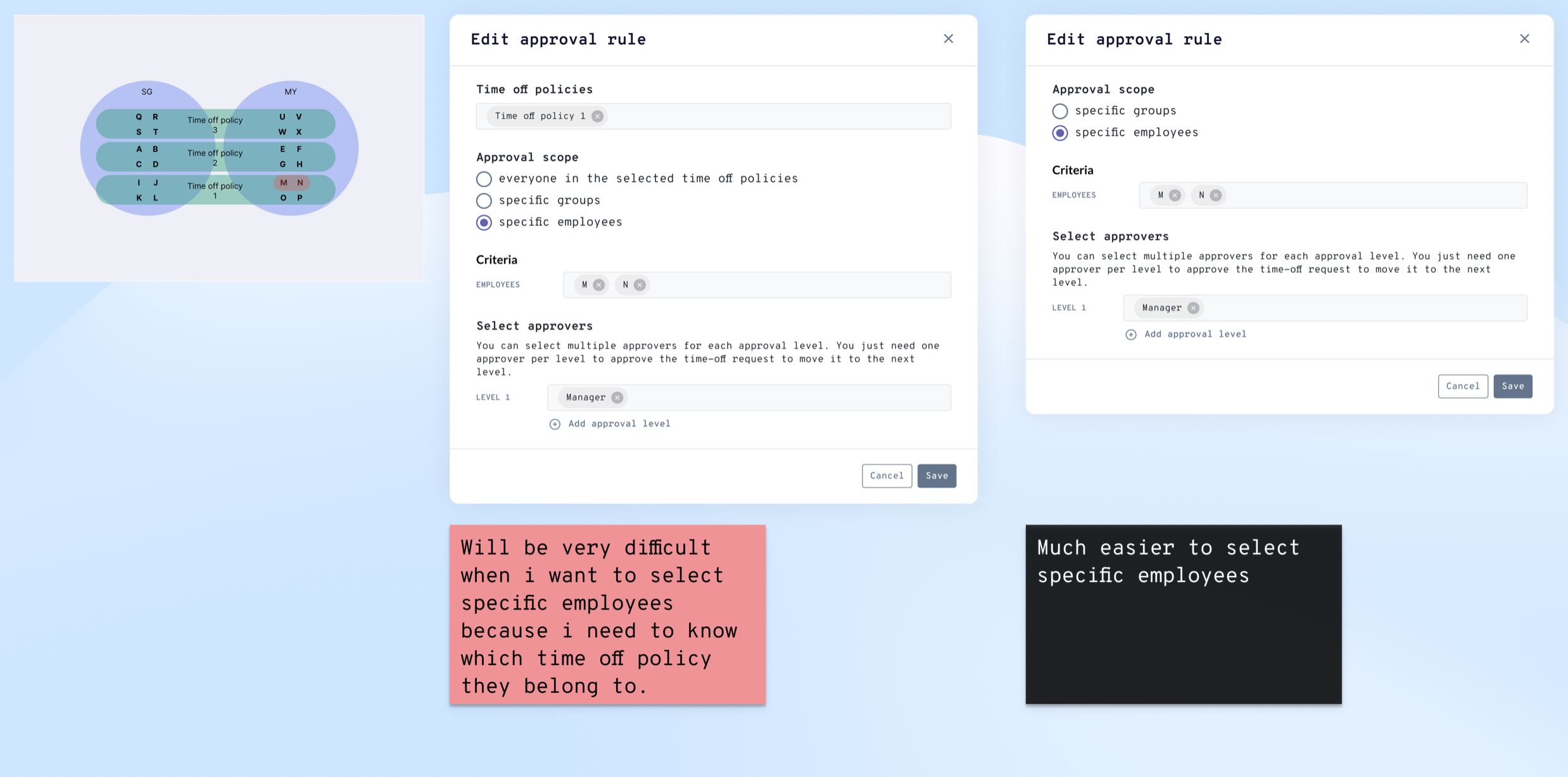
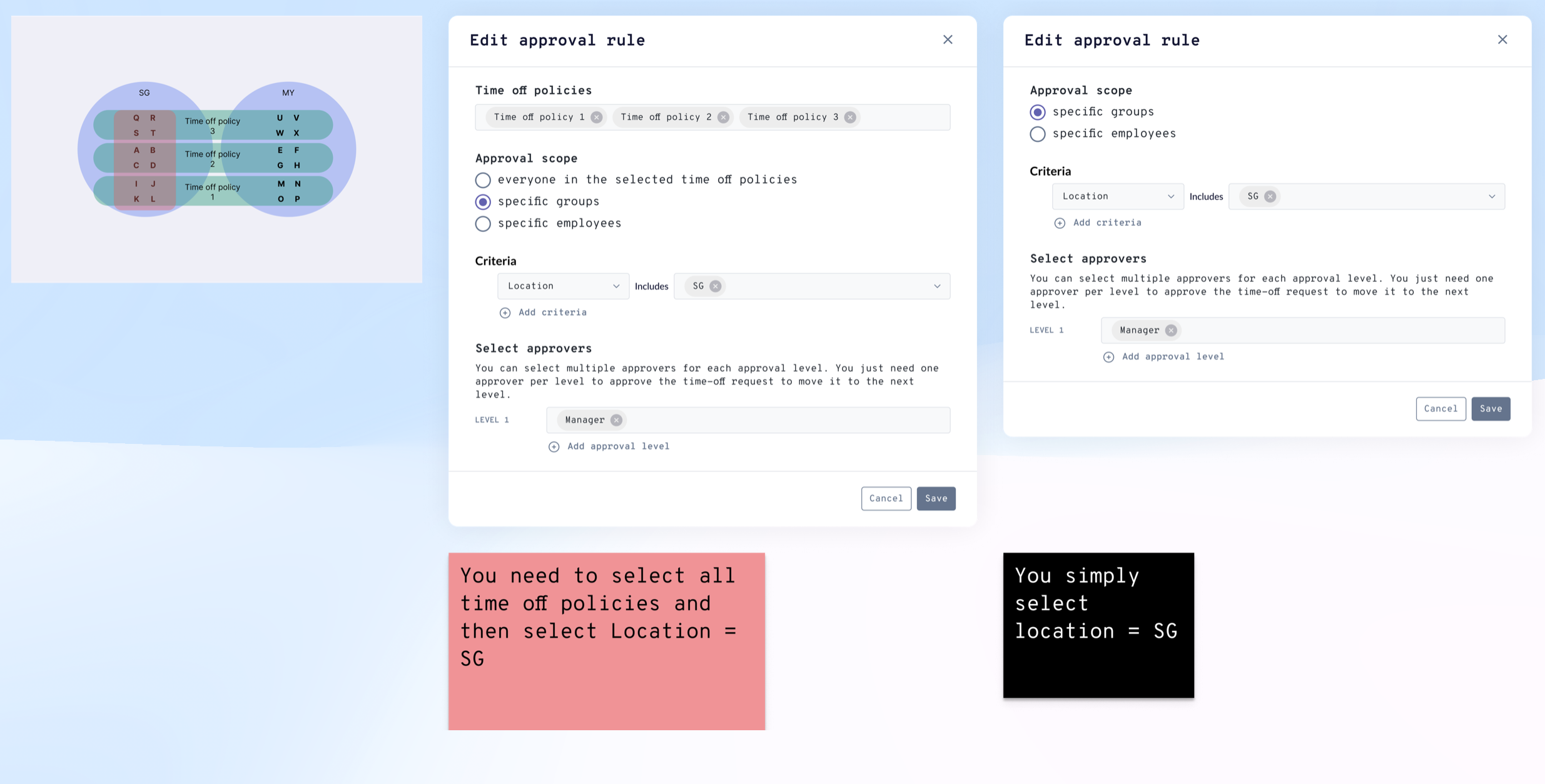
Initially, we tried using the existing elements from the Expense module and created a separate section to select the time off policies range first.
It worked fine if the criterion was simply time off policies; but in some scenarios it became unintuitive or self-defeating.
E.g. for specific employees, the admin needed to know their time off policies — which meant jumping off to another screen to retrieve them; for specific countries, admins had to select all time off policies, then select the countries.
In those scenarios, either the flow was interrupted or redundant selection was required.
Decision
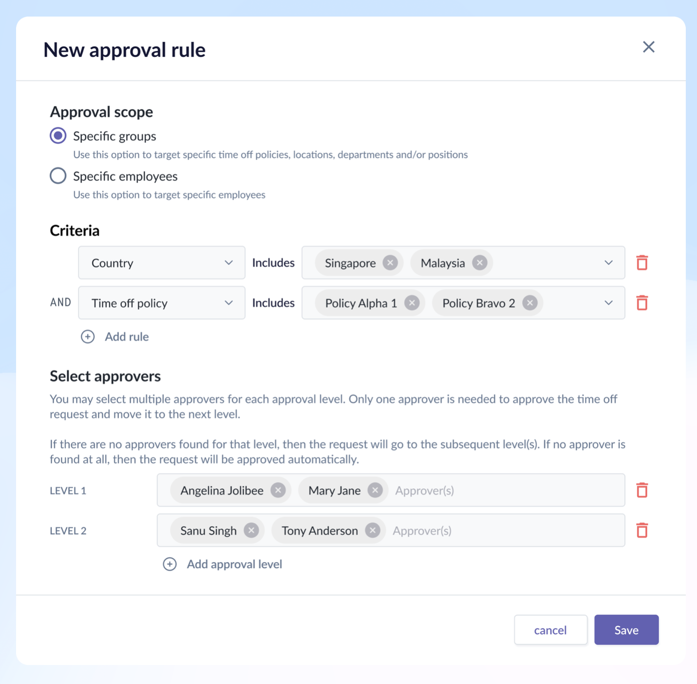
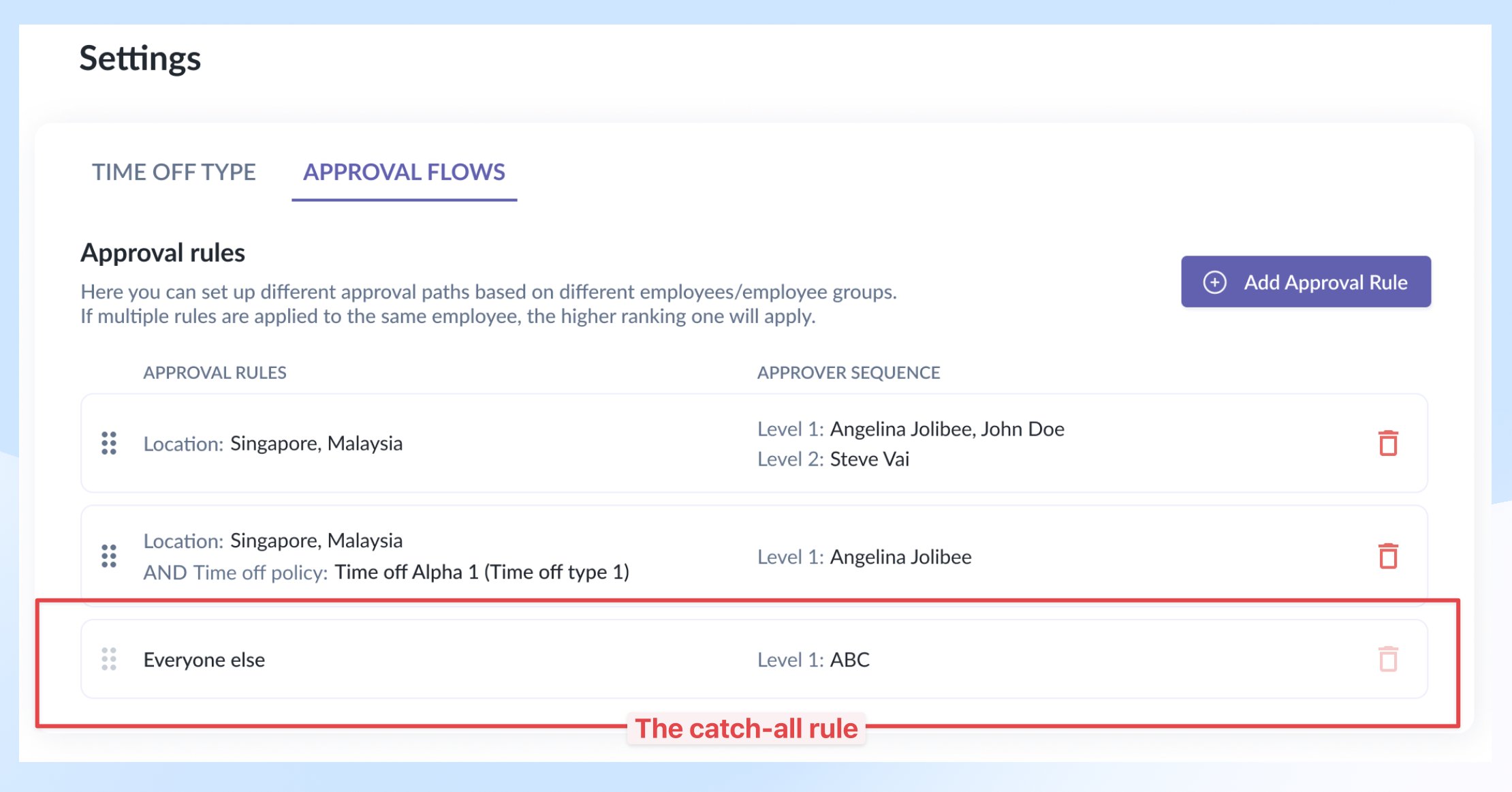
Proposed to rework the approval flow and introduce time off policy as a new criterion within the existing element.
Other additions
Added a catch-all rule – a safety net – that catches any employees who somehow managed to fall through all the approval scopes. The reason could be an incomplete profile — missing department, role, country, etc.
Rationale
- Although initial design reduced dev/QA effort, it would create friction and frustration in user experiences later. Which eventually would create additional rework.
- Folding policy into the approval flow element itself catered to all the scenarios required, and made configuration easier and faster.
Result
- During the internal testing, we managed to reduce configuration time by 25% for most of the scenarios, and reduce drop-off rate by 1/3. Drop-off means the subject couldn't finish the flow due to incomplete data.
Decision 3: Time Off Page Layout Redesign
Situation
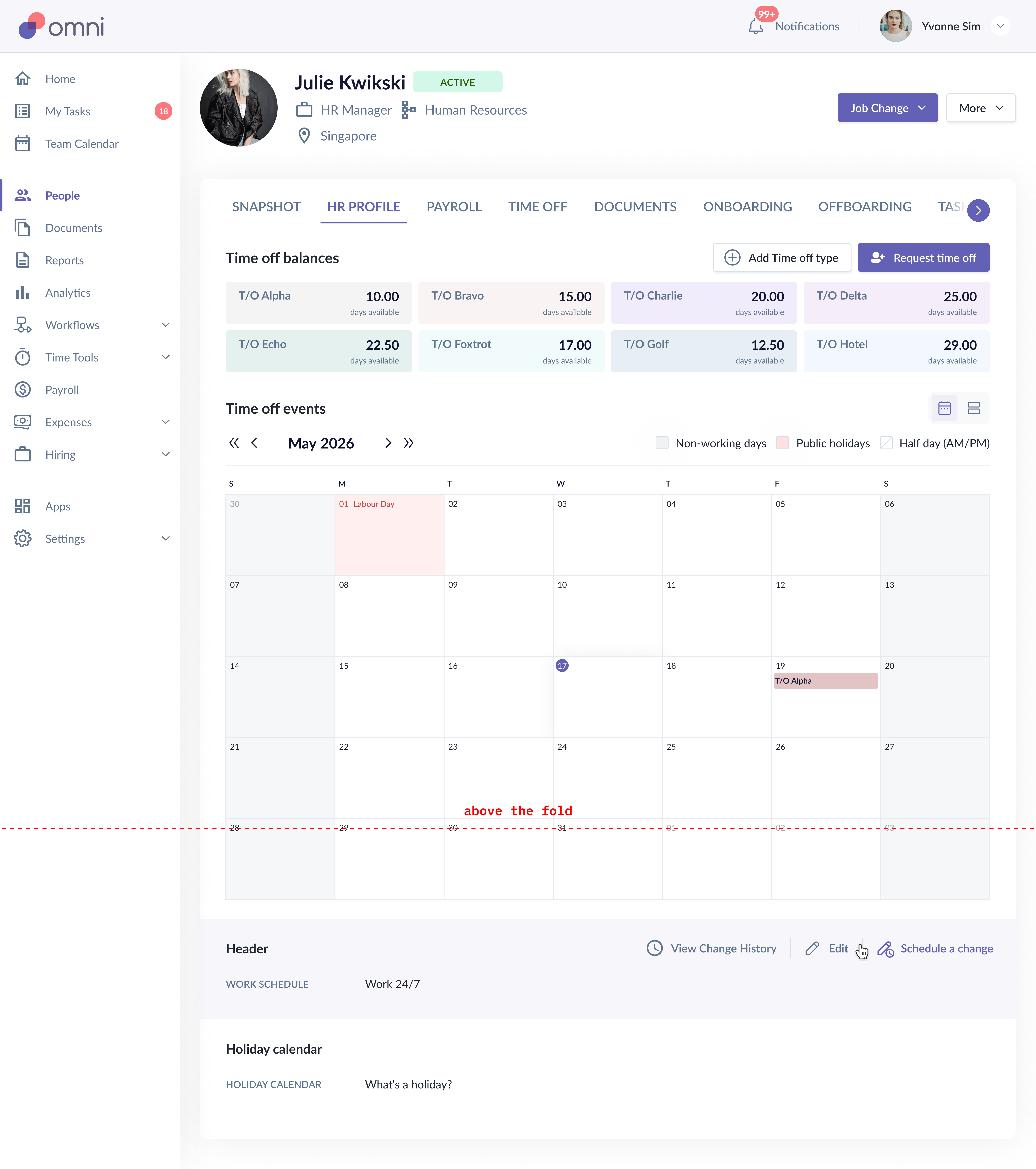
The existing time off page had several usability issues: balance cards consumed calendar space, action buttons were hidden below the fold, the calendar legend was hard to reference, and secondary items like "work schedule" and "holiday calendar" looked out of place.
Decision
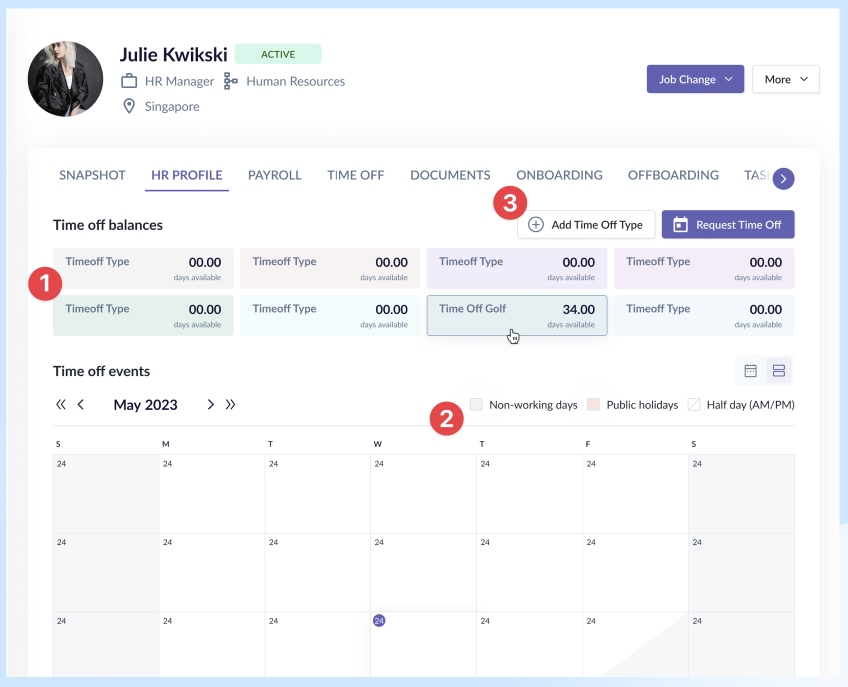
- Moved time off balance cards to the top with a refreshed visual style — they're essential context before any action.
- Calendar legend moved up for easier reference.
- Action buttons grouped together and made visible (no more hiding below the fold).
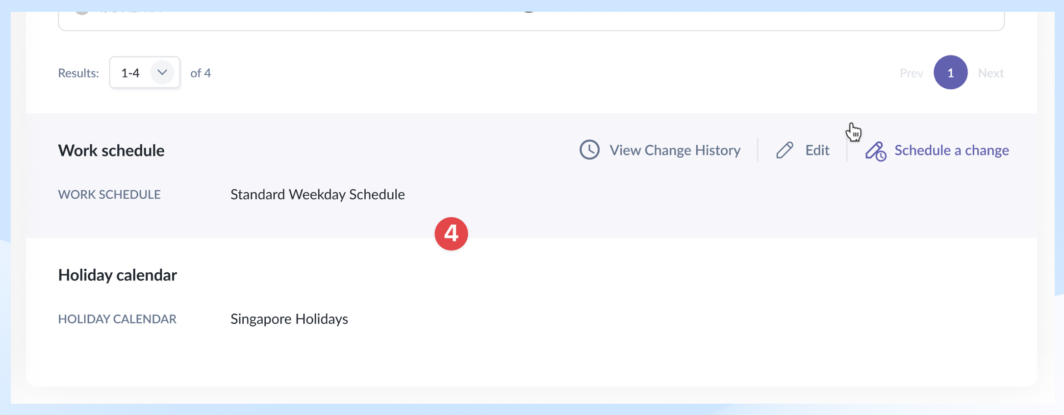
- "Work schedule" and "holiday calendar" repositioned below the calendar and revised to be consistent with elements in the Settings module.
Rationale
- Surfaced what's essential (balance, calendar, actions) and toned down what's not (configs) — so the page hierarchy matches how employees actually use it.
- Employees who accessed this page usually had these objectives: check balances, submit new requests, and check request statuses. These should be the centerpiece of the tab.
Result
- A more visually and hierarchically balanced page with essential sections at the top, allowing users the sense of control and full visibility immediately.
Decision 4: Pending Approval Count Framework
Situation
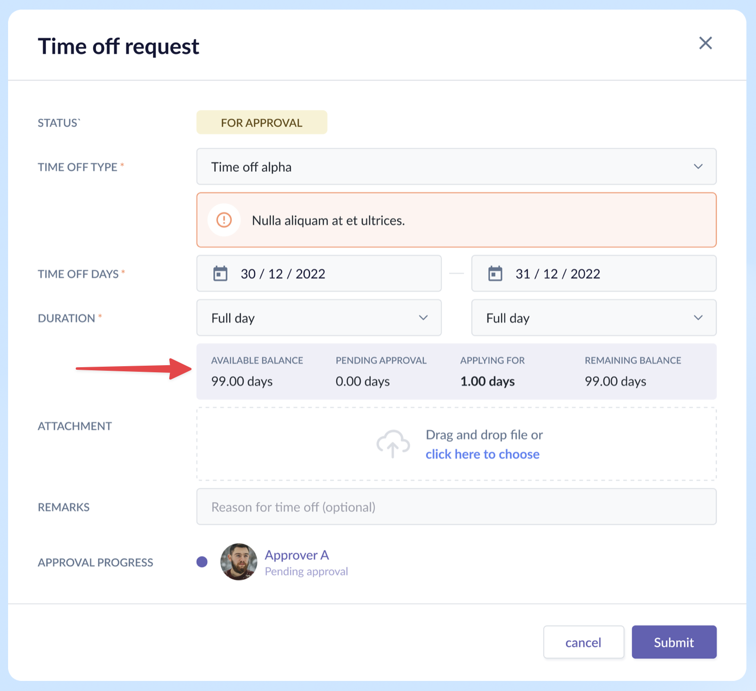
Previously, the time off request details page displayed only the number of days applied for; it lacked essential details like the available and remaining balance, and how many days are pending. The employee couldn't tell immediately if they had enough balances without pausing what they were doing to get that information. Their flow was interrupted.
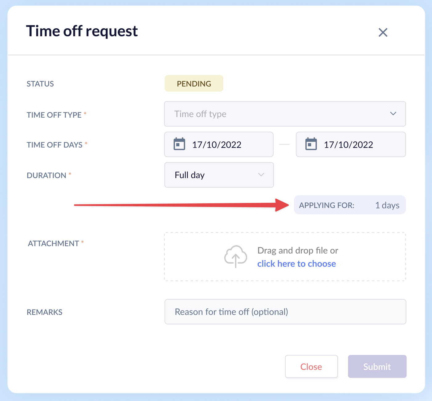
Options Considered & Decision Made
- We explored different grid and alignment layouts and finalized on the 1x4 grid format. The center-aligned grids and 2x2 grid were not suitable as they broke the reading flow and used up more space than required.
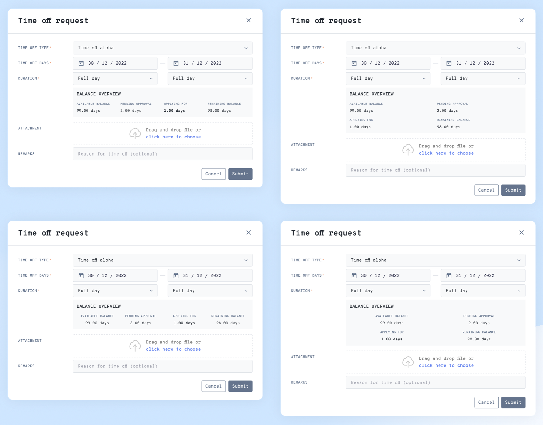
Other additions:
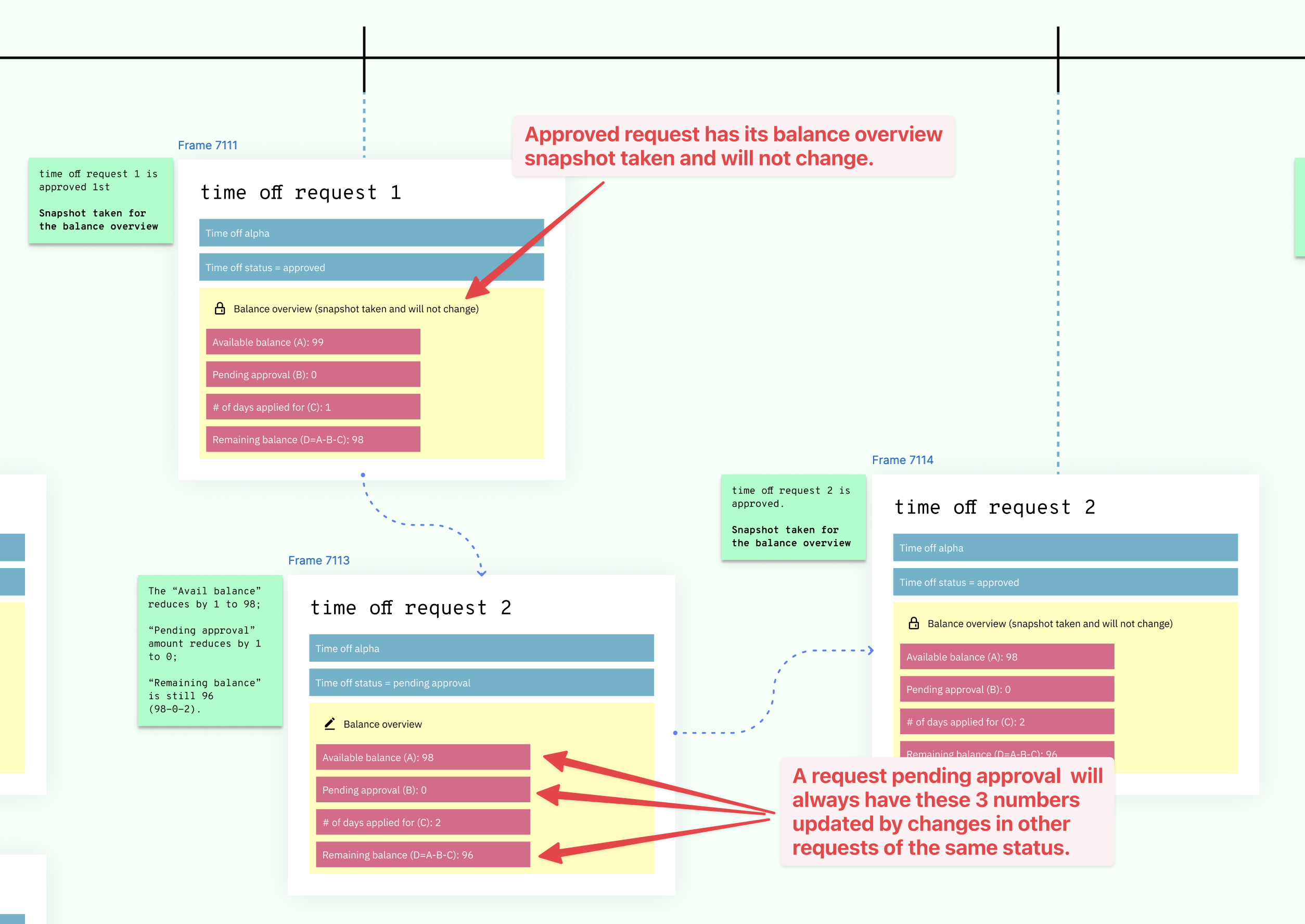
- We ensured the balance overview section is coherent for every request of the same time off type that is still in pending status.
- When a request is in pending status, details like available balance and amount pending needed to refresh to reflect changes in other requests of the same type, e.g., an employee submitted a new request, another request got approved or declined, etc.
- Once a request gets approved, balance overview retains only the number of days applied while removing the rest.
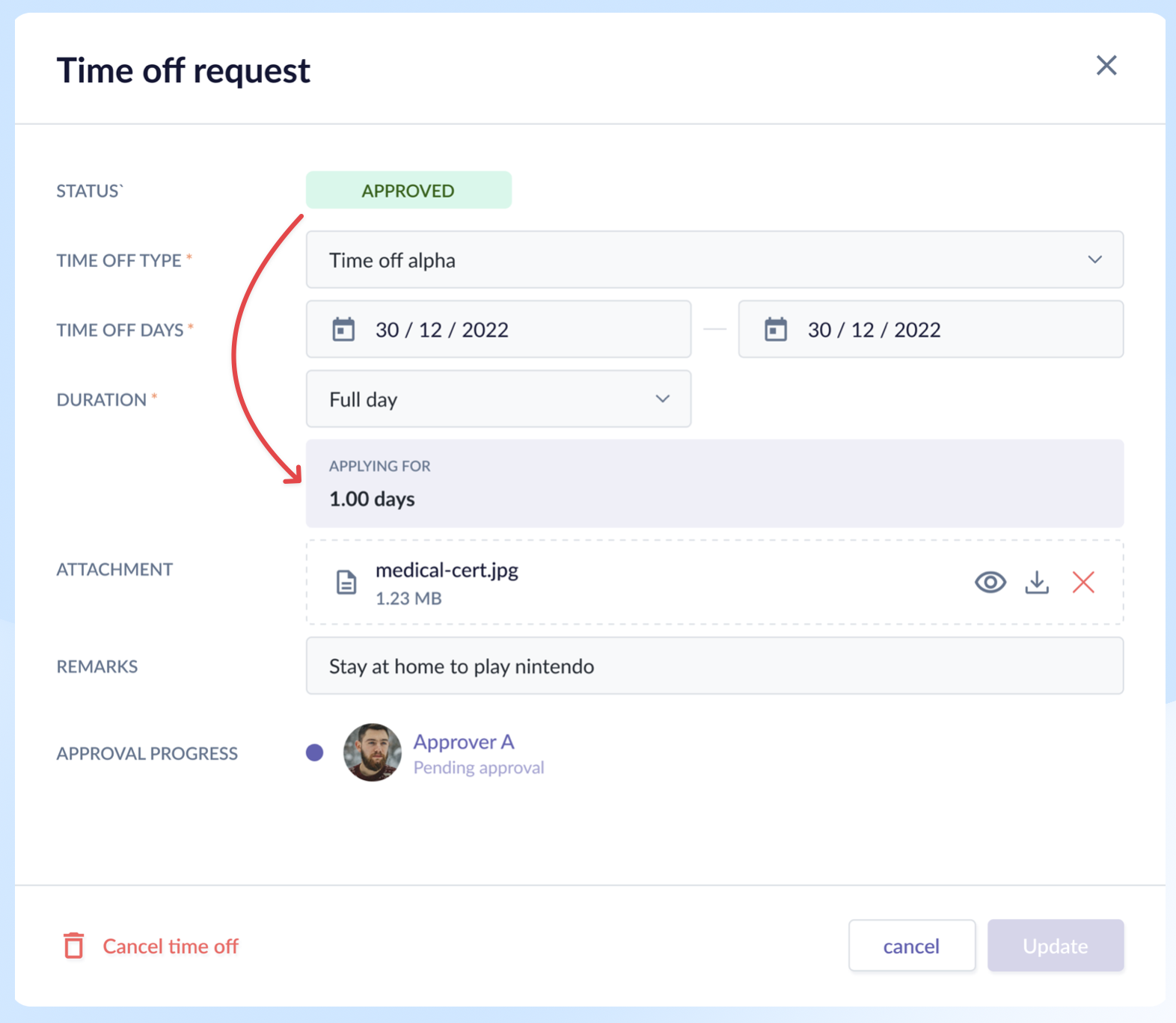
Rationale
- It fits the employee's mental model at different points of the time off request.
- When requesting, the most important thing the employee needs to know is whether she has enough balance. Which means the calculation in the balance overview section must be clear and complete.
- But once that request got approved, none of the numbers except for the days applied mattered. Their mind has already moved on to the actual time off.
Result
- For this case, there was no metric to measure its success, except for the fact that it achieved its purpose of providing the right information at different points of time based on the feedback by internal users and clients.
Reflection
What I'd Do Differently
- Handle the scenario where approvers are deleted mid-flow, leaving submissions stuck with no recourse. At the time, we decided employees would need to reapply — a known gap we accepted due to time constraints and the low probability of occurrence.
- Remove the calendar from the employee profile and have only the listing view. We already have a dedicated calendar page where I can view not only my own but also my team's time off events.
What the System Still Can't Do Cleanly
- Cater for unlimited time off — instead of showing days available, it would show days taken. This requires a different card treatment.
- Still lacking some time off types like time off with expiration, birthday leave where it could automatically be added on the employee's birth month, etc.
What I Learned
- Redesigning modules taught me that the hardest problem isn't just visual refresh – it's about understanding the main outcomes users have when accessing the page and designing for the user's mental model at each point in their journey.
- Not every design decision can be backed by a metric to measure its success; sometimes it would be more qualitative which required constant contact with clients post-release to find out how the product made them feel.